The Mercedes Benz logo is one of the most recognizable emblems in the world, symbolizing luxury, performance, and innovation. Its iconic three-pointed star has become a timeless representation of the brand’s vision to dominate land, sea, and air mobility.
Over the decades, the Mercedes logo has undergone several transformations, each reflecting the company’s growth, tech progress, and global influence in the automotive industry.
From its early beginnings in the late 19th century to the sleek and minimal design we know today, the evolution of the Mercedes emblem tells the story of a brand that has continuously shaped the future of transportation while preserving its rich heritage.
The start of a new era: 1902-1909
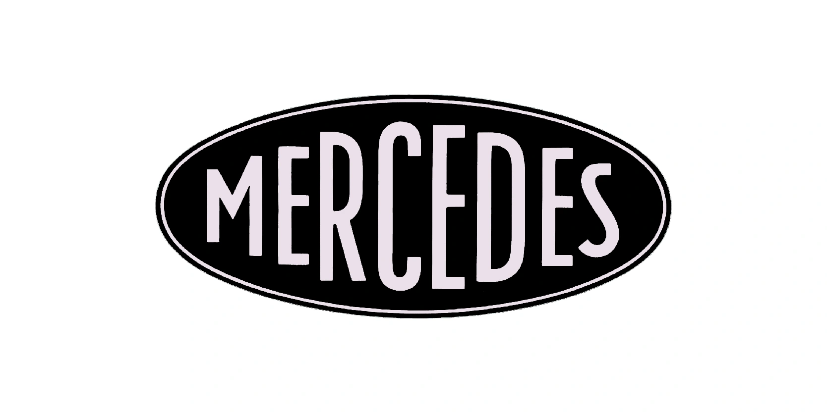
The very first Mercedes logo, introduced in 1902, looked strikingly different from the iconic three-pointed star we know today. It featured the brand name “Mercedes” written in bold, elongated white letters inside a solid black oval.
The design was simple yet elegant, emphasizing clarity and brand recognition during a time when the automobile industry was still in its infancy. Unlike later logos that carried deeper symbolic meaning, this early emblem was primarily focused on establishing the name “Mercedes” as a mark of quality and luxury.
The clean, geometric font conveyed modernity and progress, aligning with the pioneering spirit of the company. Though minimal in design, the first Mercedes logo successfully built the foundation for brand identity and set the stage for future evolutions, eventually leading to the introduction of the star symbol that would become one of the world’s most iconic emblems.
The second logo version: 1909-1916

The 1909-1916 Benz logo represented a more decorative and prestigious identity compared to the early Mercedes emblem. This design featured the word “Benz” written in tall, elegant letters placed at the center of a circular badge. Surrounding the text as a laurel wreath, a classic symbol of victory, excellence, and achievement.
The choice of the wreath was particularly significant, as it reinforced the company’s reputation for innovation and engineering success during the early years of the automobile industry. The black-and-white color scheme maintained a sense of refinement, while the intricate detailing of the wreath gave the emblem a timeless, classical appearance.
This version of the logo reflected the brand’s growing influence and desire to establish itself as a leader in luxury and performance. The 1909-1916 Benz emblem didn’t only convey prestige but also laid the groundwork for the eventual merger with Mercedes in 1926.
Color change: 1916-1926

The 1916-1926 Mercedes logo marked a defining moment in the brand’s identity with the introduction of the now-famous three-pointed star. This version featured a bold golden star set against a vibrant red circle, enclosed within a black ring outlined in gold. Around the ring, the name “Mercedes” was displayed prominently, accompanied by four smaller stars for balance and decoration.
The three-pointed star itself carried profound symbolism, representing the company’s ambition to dominate mobility on land, sea, and air. The use of gold and red gave the emblem a sense of prestige and dynamism, while the circular frame created a seal-like quality, reinforcing its authority as a trusted mark of quality.
This logo not only set Mercedes apart from its competitors but also became the foundation of the brand’s long-lasting emblem. It was a bold step toward establishing Mercedes as a global leader in innovation and luxury.
Completely new look: 1926-1933
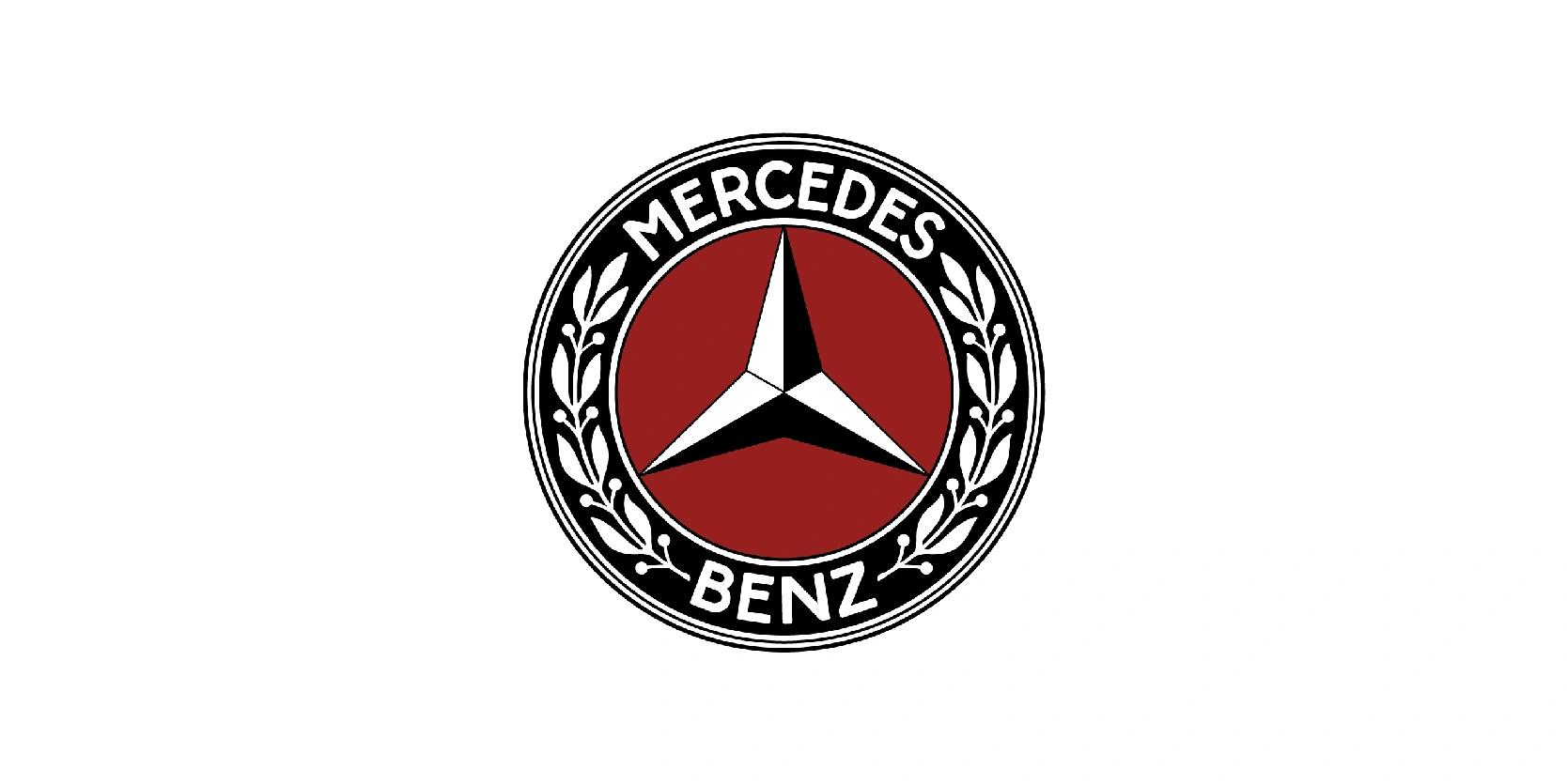
The 1926-1933 Mercedes Benz logo was the first emblem created after the historic merger between Daimler-Motoren-Gesellschaft (Mercedes) and Benz & Cie. This design combined the most recognizable elements of both brands: the Mercedes three-pointed star and Benz laurel wreath.
The result was a refined circular emblem featuring a bold silver star in the center, symbolizing dominance over land, sea, and air, while the outer ring was adorned with the name “Mercedes-Benz” surrounded by a detailed laurel wreath.
The wreath, inherited from the Benz emblem, emphasized prestige, success, and tradition, blending seamlessly with the modern, tech appearance of the star. This elegant combination represented not only unity between the two pioneering companies but also their shared vision for innovation and excellence in the automotive industry.
All in black and white: 1933-1989

The 1933-1989 Mercedes Benz logo simplified the emblem into a cleaner, more timeless design that emphasized modernity and brand recognition. The laurel wreath from earlier versions was refined into a thinner outer circle, while the central three-pointed star became sharper, sleeker, and more balanced.
Typically render in silver or chrome, this version symbolized innovation, precision engineering, and tech advancement during a time when Mercedes-Benz was solidifying its reputation as a global leader in luxury and performance vehicles.
Its minimalist appearance allowed it to adapt across different mediums, from car grilles and hubcaps to marketing materials, without losing impact. This logo became deeply associated with Mercedes Benz’s prestige throughout much of the 20th century, accompanying the brand during its growth into an international powerhouse.
The long-lasting 1933-1989 emblem proved so iconic that it directly influenced all subsequent redesigns, ensuring the three-pointed star remained the heart of Mercedes-Benz’s identity.
Still used: 1933-present
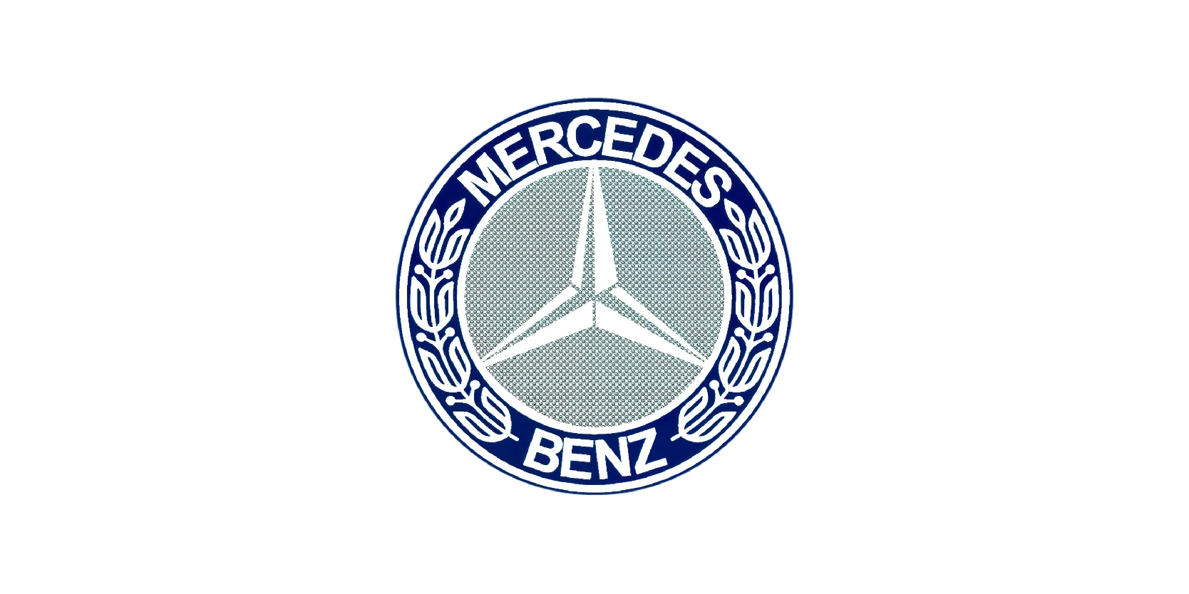
The 1933-present Mercedes Benz logo has become one of the most enduring and iconic emblems in automotive history. Centered around the sleek three-pointed star enclosed in a circle, this design symbolizes the company’s ambition to lead in transportation across land.
Initially rendered in silver and chrome, the logo reflects modernity, precision, and elegance, values central to Mercedes Benz’s identity. Over the decades, the emblem saw subtle refinements rather than radical redesigns: The lines became sharper, circle cleaner, and later versions embraced a polished 3D chrome effect to match the luxury image of the vehicles.
Despite changes in style and technology, the core star-and-circle motif has remained constant, reinforcing brand recognition worldwide. Today, the Mercedes-Benz logo represents more than just automobiles; it’s a global symbol of innovation and prestige.
An entire new look: 1989-2009

This is the logo that most people know about when it comes to Mercedes Benz, and the time it became popular worldwide. Between 1989 and 2009, Mercedes-Benz refined its logo into a sleek, modern version that highlighted the brand’s luxury and tech edge. The three-pointed star, already well established as the company’s central symbol, was rendered in a polished silver-gray tone, giving it a more contemporary and elegant appearance.
The circle enclosing the star became thinner and cleaner, reflecting a minimalist yet powerful design language. This period marked Mercedes-Benz’s push into the premium automotive market on a global scale, and the logo perfectly aligned with the image of sophistication, innovation, and reliability.
Frequently presented in chrome on vehicles, the emblem seamlessly blended with the brand’s styling, reinforcing its identity as a leader in engineering excellence. The 1989-2009 logo carried Mercedes-Benz into the modern era while preserving the timeless simplicity and prestige of the three-pointed star.
Minor refinements: 2009-2011

Some minor refinements were made to this logo, but didn’t last long. The iconic three-pointed star remained, but it was now rendered with a metallic gradient and shading that gave it depth. While the core design remained unchanged, the subtle yet powerful shift to a new appearance reinforced Mercedes-Benz’s image as a forward-looking automotive leader.
However, it wasn’t preferred by the majority so it only lasted two years.
Modern logo: 2011-present

Since 2011, the Mercedes-Benz logo has embraced a refined, contemporary style that continues to symbolize prestige and innovation. The iconic three-pointed star within a circle remains unchanged in form but is now offered in two primary variations: a sleek, flat design for print and digital use, and a polished 3D chrome version for vehicles.
This dual approach allows the emblem to adapt seamlessly to both modern branding and luxury automotive design. The 3D version emphasizes metallic textures and depth, reinforcing the premium feel of Mercedes cars, while the flat version highlights simplicity and elegance in digital spaces.
By maintaining the timeless star-and-circle motif yet modernizing its execution, Mercedes-Benz has ensured the emblem stays relevant in an evolving design landscape.
The Mercedes logo stands out more than just an emblem
The Mercedes logo stands out more than just an emblem, it’s a timeless symbol of innovation, prestige, and engineering excellence. From its earliest wordmark in 1902 to the refined three-pointed star used today, each evolution of the logo reflects the brand’s journey and its unwavering pursuit of progress.
The star, representing dominance over land, sea, and air, has become one of the most recognized symbols in the world, embodying both tradition and modernity. While the design has been subtly refined over the decades, its essence has remained constant, ensuring instant recognition and trust.
The Mercedes logo is not only a mark of luxury automobiles but also a lasting emblem of ambition, success, and innovation, qualities that continue to define Mercedes-Benz as a leader in the global automotive industry.
