The history of the Audi logo is a story of unity, innovation, and timeless design. Instantly recognizable by its four interlocking rings, the emblem symbolizes the 1932 merger of four German automobile manufacturers: Audi, DKW, Horch, and Wanderer, which came together to form Auto Union AG.
This powerful symbol of cooperation and progress became the foundation of Audi’s identity, reflecting not only its origins but also its enduring commitment to precision engineering and forward-thinking design. Over the decades, the Audi logo has undergone subtle refinements, which has shaped its logo into what it’s today.
More than just a brand, the Audi four rings have had a deep meaning for a long time and in this article, we’ll dive deeper to learn more about them.
Prelaunch: 1909
Audi’s prelaunch image is built on a legacy of precision engineering, luxury, and forward-thinking design. Before introducing a new model, the brand carefully crafted their logo by blending innovation with exclusivity.
Audi positions itself as more than just a car manufacturer, it represents status, sophistication, and cutting-edge technology. Its first prelaunch logo started only with the Audi wordmark, but was more used as an experiment rather than becoming an official logo
The beginning of the official logo: 1909

This logo represents Audi’s very first emblem, introduced in 1909. The design is bold and striking, featuring a larger number “1” rising above a downward-pointing triangle, symbolizing strength, id, ambition, and forward momentum.
Inside the triangle, the brand name “Audi” is written in a stylish, cursive script, giving it a refined and elegant look. The spherical element at the base of the “1” adds a sense of modernity and dynamism for its time.
The start of Audi’s greatness: 1910-1932

This early Audi logo, used between 1910 and 1932, is a striking departure from the modern design we know today. It features a bold, geometric style with a large number “1” above a downward-pointing triangle, symbolizing ambition and strength. The word “Audi” sits inside the triangle in a stylized font that reflects the logo design trends of the early 20th century.
This logo represented Audi’s identity in its formative years, a period when the brand was establishing itself in the competitive automotive market. The strong use of black and white gave it a sense of seriousness and authority. While it may seem quite different from today’s sleek rings, it played an important role in shaping Audi’s early brand image and legacy.
The four rings: 1932-1949
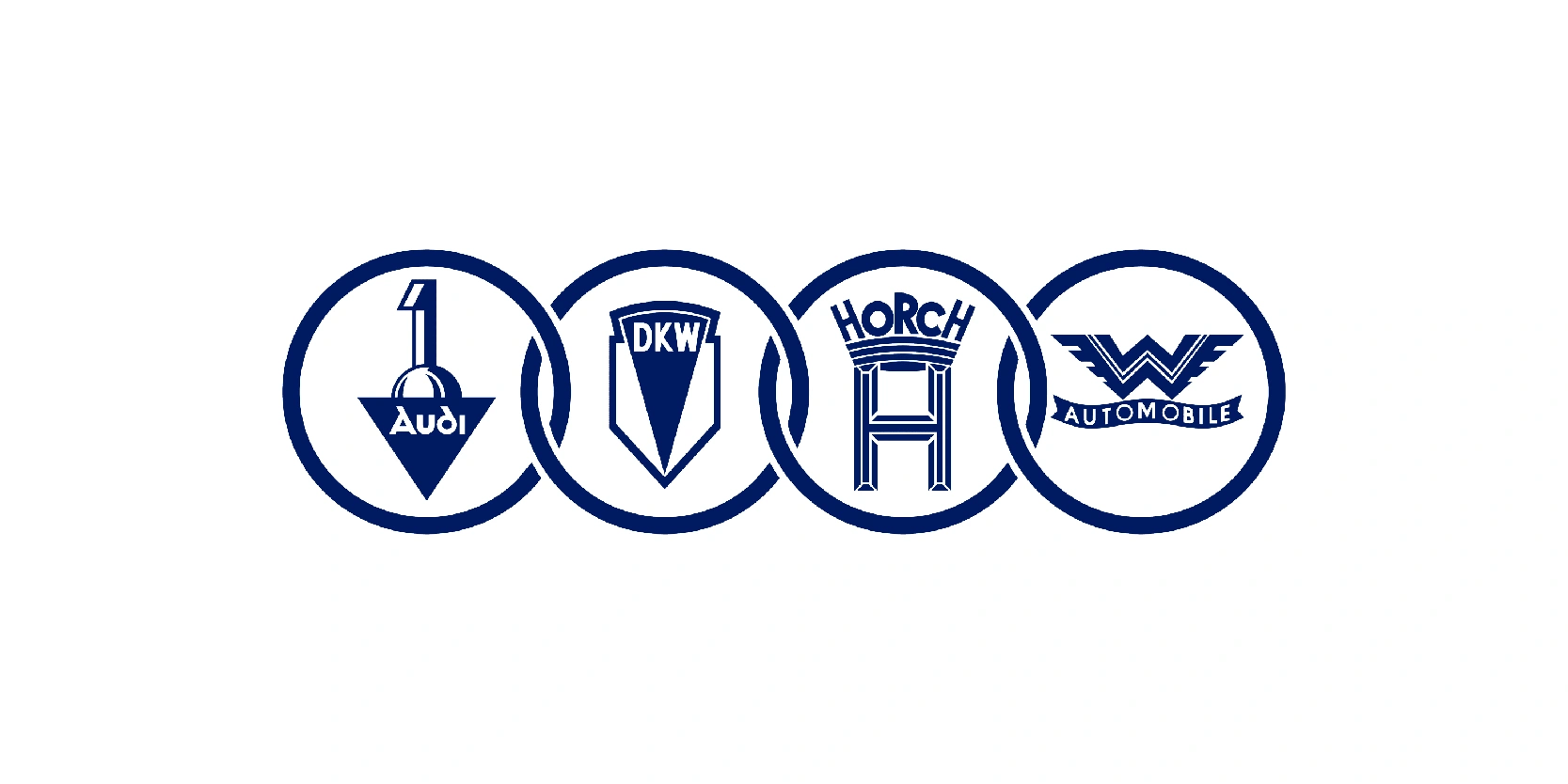
This logo, used between 1932 and 1949, marks a pivotal moment in Audi’s history. It represents the formation of Auto Union AG, a merger of four German car manufacturers: Audi, DKW, Horch, and Wanderer. Each company’s emblem is displayed within its own circle, linked together to symbolize unity and collaboration. The interconnected rings later inspired Audi’s iconic four-ring logo that we still recognize today.
At the time, this design highlighted the strength of combining expertise; Audi for luxury, DKW for small cars and motorcycles, Horch for prestige vehicles, and Wanderer for mid-range automobiles. It was more than just a logo; it was a symbol of survival and growth during a turbulent era in the automotive industry. This historic design laid the foundation for Audi’s modern identity.
Auto Union: 1949-1969
Between 1949 and 1969, Audi used the Auto Union logo, which prominently featured the now-familiar four interlocking rings. This design directly symbolized the four founding companies: Audi, DKW, Horch, and Wanderer that had merged under Auto Union AG. Unlike the earlier version where each brand’s individual emblem was visible inside the rings, this streamlined version emphasized unity and collective strength.
The words “AUTO UNION” appeared boldly across the center, reinforcing the shared identity of the group. The clean, modern look reflected the post-war era’s push for clarity, resilience, and progress. While it lacked the individual flair of each brand, it captured the essence of collaboration, laying the groundwork for Audi’s evolution into a globally recognized automotive leader. This logo is a vital step in the journey toward the sleek four rings we associate with Audi today.
Audi NSU: 1969

In 1969, a major shift happened for the brand when Auto Union merged with NSU Motorenwerke AG, forming Audi NSU Auto Union AG. This merger marked the rebirth of Audi as the central name moving forward, while the old Auto Union identity began to fade.
The logo evolved as well, simplifying the design by keeping the four interlocking rings but dropping the “Auto Union” text. This change gave the symbol a cleaner, more timeless appearance, focusing entirely on the rings as the representation of unity and heritage.
The updated emblem reflected Audi’s new direction: modern, innovative, and ready to expand beyond its German roots. By re-establishing Audi as the lead brand, the 1969 redesign was a turning point that set the stage for the sleek, minimalist logo style the company still uses today.
No wordmark: 1969-1995
From 1969 to 1995, Audi’s logo entered a new era of simplicity and recognition. After the merger with NSU, the brand dropped the “Auto Union” text and adopted the four interlocking rings on their own as the primary symbol and initially, were colored in dark blue.
This was the first time the rings stood alone, free from additional wording, giving the logo a modern and minimalistic identity. The design perfectly embodied unity, strength, and Audi’s heritage while positioning the company as a forward-thinking carmaker.
During this period, Audi established itself as a premium automotive brand, competing with other German giants like BMW and Mercedes-Benz. The rings became instantly recognizable worldwide, symbolizing both tradition and innovation. This long-running design proved timeless, forming the backbone of Audi’s visual identity for decades and paving the way for the refined logos that followed.
The red background: 1978-1995
From 1978 to 1995, Audi’s logo underwent a striking shift that moved away from the iconic four interlinked rings. Instead, the company embraced a minimal yet bold design: a simple white “Audi” wordmark placed inside a solid red circle with a white outline. This logo was a clear departure from the brand’s earlier and more traditional imagery, signaling a desire for a modern, streamlined identity during a period of reinvention for the company.
The choice of red as the background color conveyed energy, passion, and dynamism, qualities that Audi wanted to associate with its vehicles. The clean, white lettering emphasized clarity and confidence, while the circular shape gave the logo balance and a sense of inclusivity. By focusing solely on the name, Audi highlighted its individuality and set itself apart from competitors, relying on strong typography and color rather than complex symbols.
The premium look: 1995-2009
From 1995 to 2009, Audi brought back its most recognizable symbol: the four interlinked rings and paired them with a modernized “AUDI” wordmark. The rings, which represent the historic Auto Union companies (Audi, DKW, Horch, and Wanderer), were refined with a sleek, chrome-like silver finish that reflected precision, innovation, and engineering excellence. This gave the logo a three-dimensional, metallic look that aligned with the premium positioning of Audi vehicles during this period.
Alongside the rings, the “Audi” wordmark appeared in a clean, sans-serif font, usually in red, complementing the silver emblem. The combination of bold typography and polished rings created a strong, contemporary identity, one that reinforced Audi’s reputation as a luxury carmaker while emphasizing both tradition and modernity.
This era of the logo coincided with Audi’s growing global prestige, especially as the brand expanded its lineup with models like the A4, A6, and the introduction of the Audi TT and the Audi R8. The 1995–2009 logo symbolized not only a return to heritage but also Audi’s evolution into a design and technology leader.
An updated wordmark with the four rings: 2009-2016
From 2009 to 2016, Audi refined its logo once again, modernizing the iconic four rings to match the brand’s sleek and forward-looking identity. The rings were flattened into a high-gloss, monochrome silver design, giving them a more minimalist yet still premium appearance. This change aligned with the broader trend in automotive branding toward simplicity and digital adaptability, ensuring the logo looked sharp on both physical vehicles and digital platforms.
The “Audi” wordmark continued to be used, most often in black or dark gray, placed separately from the emblem instead of being tightly integrated. This separation allowed the four rings to stand as a powerful visual icon on their own, instantly recognizable without additional text.
Audi’s black emblem: 2016-present
From 2016 to the present, Audi’s logo has taken on an even more minimalistic and contemporary form. The four interlinked rings remain the core element, but they were redesigned in a flat, two-dimensional style, usually displayed in solid black or white depending on the background. This shift followed the global trend of “flat design,” which prioritizes simplicity, clarity, and digital adaptability across websites, apps, and modern media.
By removing gradients, shadows, and metallic effects, Audi emphasized timelessness and purity in its visual identity. The rings stand alone more frequently, with the “Audi” wordmark often used independently or in flexible layouts, giving the brand versatility across different platforms and campaigns.
This flat design reflects Audi’s focus on sustainability, innovation, and the future of mobility, especially as the company expands into electric vehicles and digital technologies. The clean logo reinforces the idea of Audi as a forward-thinking luxury brand, rooted in tradition but designed for a modern, digital-first era.
The history of Audi’s logo highlights is more than just visual changes
Yes, it’s much more than visual changes, it reflects the brand’s journey from its origins in the early 20th century to its position today as a global leader in luxury and innovation. From the bold red circle wordmark of the late 20th century to the sleek, flat four rings of the modern era, each redesign has balanced tradition with forward-thinking design.
The rings remain the timeless core, symbolizing unity, heritage, and strength, while subtle refinements over the decades show Audi’s ability to adapt to changing times and technologies. Ultimately, the evolution of the Audi logo mirrors the brand’s philosophy: advancing through design, precision, and progress while staying true to its iconic identity.
