The Marlboro logo is one of the most recognizable symbols in the world, carrying with it decades of branding history and cultural impact. Known for its bold design and strong identity, the logo has played a key role in shaping Marlboro’s image as more than just a cigarette brand.
Over time, it has evolved to match shifting markets, regulations, and design trends, yet it has always maintained its distinctive character.
In this article, we’ll explore the history of the Marlboro logo, how it has changed through the years, and the design choices that made it an enduring icon.
The history of Marlboro
Marlboro was first introduced in 1924 by Philip Morris as a cigarette brand aimed at women, marketed with the slogan “Mild as May.” At the time, the packaging featured a red band around the filter to help conceal lipstick stains. Sales were modest, and the brand remained relatively quiet for decades.
In the 1950s, Marlboro was rebranded for a broader market after health concerns around smoking began to rise. Filters were positioned as a “safer” choice, and the company shifted focus to appeal to men. This led to the creation of the famous “Marlboro Man” campaign, which launched in 1955 and portrayed rugged cowboys as the face of the brand.
The campaign became one of the most successful in advertising history, transforming Marlboro into the world’s best-selling cigarette brand. Its logo and red-and-white packaging soon became synonymous with strength, independence, and adventure. Despite regulatory challenges and health warnings, Marlboro has remained a dominant name in the tobacco industry, with its branding leaving a lasting cultural imprint.
1924-1955
The very first Marlboro logo, introduced in 1924, looked quite different from the bold and masculine image the brand is known for today. At the time, Marlboro was marketed as a cigarette for women, and the logo carried a softer, more elegant design to match that positioning.
The brand name “Marlboro” was written in a serif font, which conveyed a sense of refinement and tradition. Surrounding the text were delicate flourishes, giving the mark a graceful and ornamental appearance. This choice was intentional, as the company wanted to appeal to a female audience, emphasizing sophistication and subtle luxury.
The logo paired well with the slogan “Mild as May,” which highlighted the smoothness of the product and reinforced its feminine appeal. While it might not have had the bold impact of later designs, this original version laid the foundation for Marlboro’s identity and reflected the cultural trends of its early years.
1954
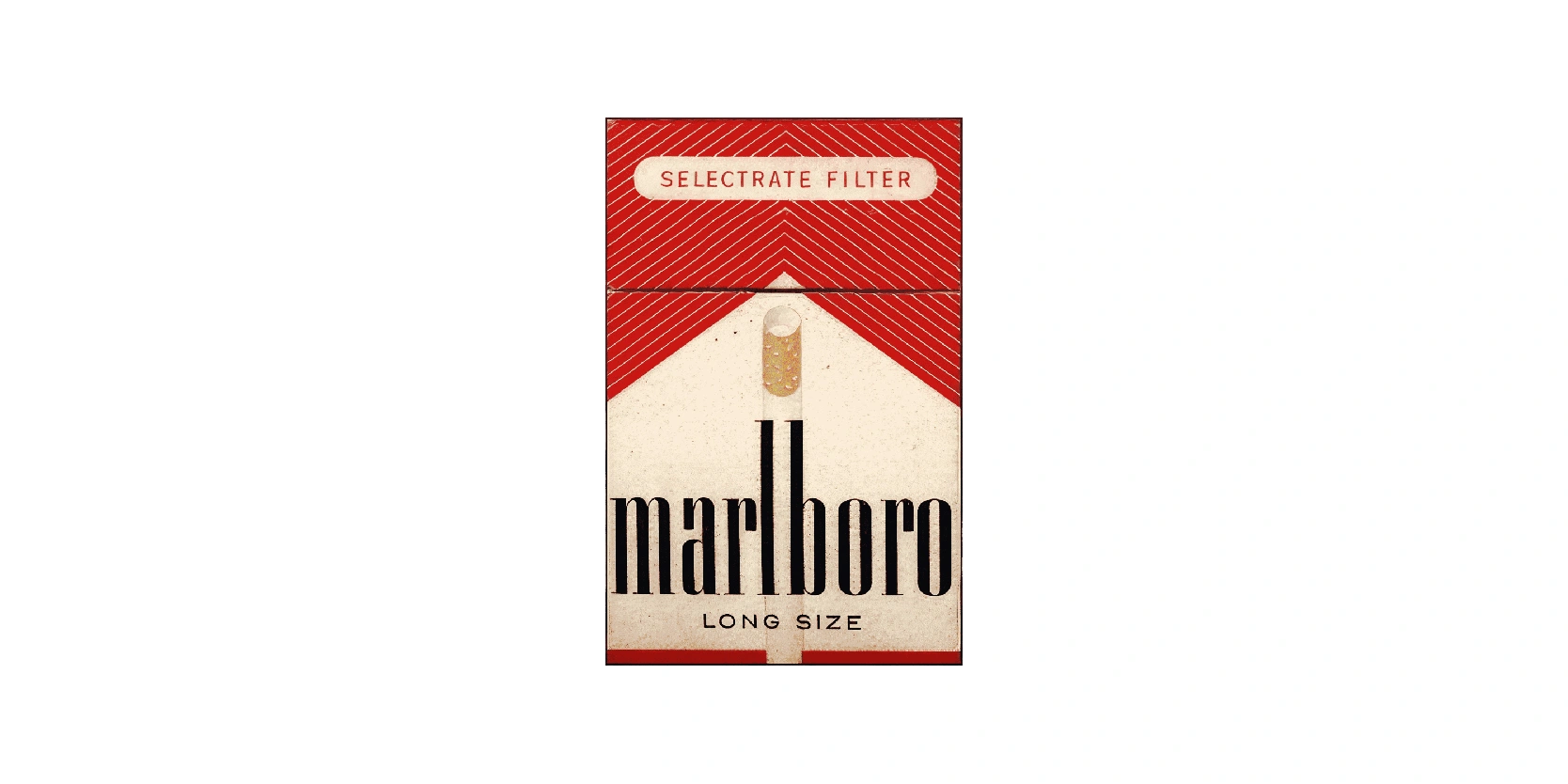
This Marlboro packaging from 1954 marked a major turning point in the brand’s identity. After struggling with its original positioning as a women’s cigarette, Marlboro was reintroduced with a bolder, more modern look aimed at a wider audience. The design featured the iconic red chevron, which quickly became one of the most recognizable elements of the Marlboro brand.
The strong geometric shape at the top gave the pack a sense of structure and authority, moving away from the delicate ornamentation of earlier designs. The wordmark itself was set in a tall, sans-serif typeface, reflecting simplicity and strength.
The filter was also highlighted with the words “Selectrate Filter”, emphasizing innovation at a time when filtered cigarettes were marketed as a healthier choice. This redesign not only revitalized Marlboro but also set the stage for the rugged, masculine image that would later be cemented by the famous Marlboro Man campaign.
1955-1959
Between 1955 and 1959, Marlboro refined its logo into the iconic form that became instantly recognizable worldwide. Originally introduced in the 1920s as a cigarette brand targeted toward women, Marlboro underwent a major rebranding in the mid-1950s to appeal to a broader audience, especially men.
The logo of this period emphasized boldness and strength, with sharp, confident typography paired with a distinctive geometric chevron-like “rooftop” design. This red triangular element symbolized masculinity and ruggedness, qualities the brand was working hard to project. The use of strong contrasts, primarily black and red against a white backdrop, created a striking and modern look that distinguished Marlboro from its competitors.
This visual identity aligned closely with the launch of the now-famous “Marlboro Man” campaign in 1955. Also, let’s not forget about the initials “PM” for Philip Morris, the parent company, which is the parent company and cornerstone of the brand’s heritage. This helped shift Marlboro's image, showing that it can also be for men as well.
1955-1961
Between 1955 and 1961, the Marlboro logo existed in a much simpler form than the bold rooftop design that would later define the brand. During this period, the logo consisted solely of the wordmark “Marlboro” presented in a clean, serif typeface. The choice of lettering conveyed elegance, seriousness, and authority, reflecting the cigarette’s repositioning from a niche women’s brand into a product aimed at a wider audience.
Unlike later versions, there were no additional graphic elements or the iconic red chevron; the simplicity emphasized the brand name itself, making it the central focus of recognition. The restrained look mirrored a transitional phase in Marlboro’s identity, as the company experimented with marketing strategies to strengthen its masculine appeal. By relying only on typography, the 1955–1961 logo carried a minimalist confidence, laying the groundwork for the bolder visual shift that followed in the early 1960s with the introduction of the red rooftop design.
1959-present
Introduced in the early 1960s, the Marlboro logo featuring the bold red rooftop became one of the most iconic brand symbols of the century. The design combined a striking triangular “roof” shape in red with the classic Marlboro wordmark in a tall, elegant serif font.
Beneath the rooftop, a heraldic crest featuring two lions and a crown added a sense of prestige and tradition, subtly linking the brand to European heritage and authority. The vivid red chevron was not just visually distinctive, but also symbolically powerful, evoking energy, boldness, and masculinity.
This change coincided with Marlboro’s successful marketing campaign featuring the “Marlboro Man,” which redefined the brand as rugged and adventurous. The logo’s geometric balance and sharp contrasts ensured instant recognition on packaging and advertising. By the late 1960s, the red rooftop emblem had firmly established Marlboro’s visual identity, transforming it from a struggling brand into a worldwide symbol of strength and independence.
1961-1963
Between 1961 and 1963, Marlboro used a logo that relied solely on its distinctive wordmark. The design featured the name “Marlboro” in a tall serif typeface, giving it a strong yet refined appearance. Unlike later versions, there were no graphic elements such as the red rooftop or crest; instead, the typography itself carried the brand’s identity. It’s basically very similar to its previous logo in 1955-1961, but since 1959, Marlboro has used more than one logo.
This minimalist approach reflected a transitional stage in Marlboro’s history, as the company was in the process of repositioning its image. Originally marketed toward women, Marlboro was shifting its focus to a broader audience, particularly men, and the bold lettering projected authority and confidence.
However, this logo only lasted two years, so after, it would get replaced entirely.
1977-present
Introduced in the late 1970s, the Marlboro logo underwent a refinement that solidified its place as one of the most recognizable brand marks in the world. The design prominently featured the bold red rooftop chevron, sharper and more streamlined than earlier iterations. Beneath it sat the Marlboro wordmark in a heavy, black serif typeface, which gave the logo a commanding and authoritative presence.
This combination of striking red geometry and strong typography created an immediate visual impact, making the packaging stand out unmistakably on store shelves. Unlike the earlier 1960s versions that included the ornate crest, this simplified design embraced modern minimalism, focusing attention on the geometric shape and the name itself. The result was a cleaner, more versatile logo that could be reproduced across advertising, sponsorships, and global markets. By the late 1970s, this version had become inseparable from the Marlboro brand identity, embodying strength, independence, and timeless recognition.
The evolution of the Marlboro logo reflects more than just graphic design changes
The evolution of the Marlboro logo reflects more than just changes in graphic design, it mirrors the brand’s transformation into a global icon. From the understated wordmark of the 1950s to the bold red rooftop introduced in the 1960s, each stage of development strengthened Marlboro’s identity and cultural presence.
The logo’s progression highlights how design choices can redefine perception, shifting from elegance and simplicity to rugged strength and instant recognition. Over time, the rooftop emblem and commanding typography became synonymous with adventure, independence, and resilience, ensuring Marlboro’s enduring place in visual branding history.
Today, the Marlboro logo stands not only as a symbol of a product but also as one of the most recognizable emblems in modern advertising. Its journey demonstrates the power of strategic design evolution, proving that a logo, when carefully refined, can become timeless.
