The Pringles logo is instantly recognizable, yet few people realize just how much it has evolved since the brand’s debut in the 1960s. From the cheerful, mustachioed “Mr. Pringle” to subtle modern tweaks, each redesign reflects shifts in marketing trends, consumer preferences, and brand identity.
Exploring the history of Pringles’ logo reveals more than just aesthetic changes—it offers a glimpse into how one of the world’s most beloved snack brands has stayed relevant across decades.
In this article, we’ll learn more about the evolution of the Pringles logo, highlighting the key transformations and the reasoning behind each redesign, showing how this iconic brand has changed over the years.
1967-1980
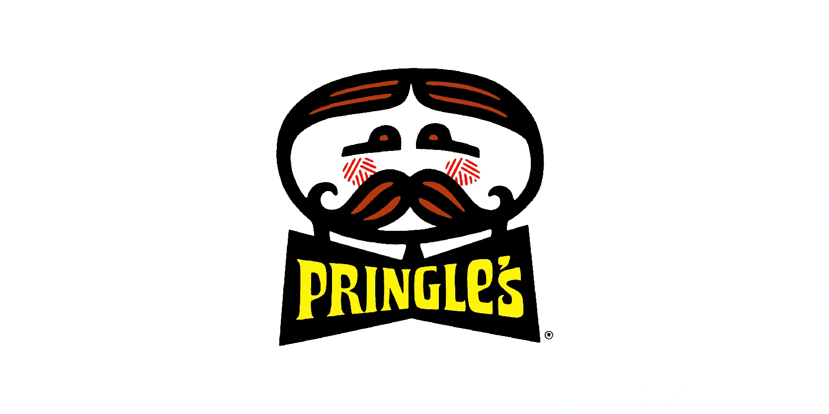
Pringles’ first logo, introduced in 1967, set the stage for the brand’s instantly recognizable identity. Central to the design was “Mr. Pringle,” a cheerful cartoon character with a prominent, bushy mustache, round eyes, and a neatly tied bow tie. His playful yet refined appearance was designed to appeal to a broad audience, giving the brand a friendly and approachable personality.
The logo’s simplicity and clear lines made it highly recognizable on Pringles’ unique stackable cans, helping the brand stand out in a crowded snack market. At the time, mascot-driven logos were a popular marketing strategy, and Pringles leveraged this trend effectively.
While the design has evolved over the decades, the original logo laid the foundation for the character-focused branding that continues today. It established a visual identity that combined fun, quality, and memorability—qualities that still define Pringles.
1980-1986
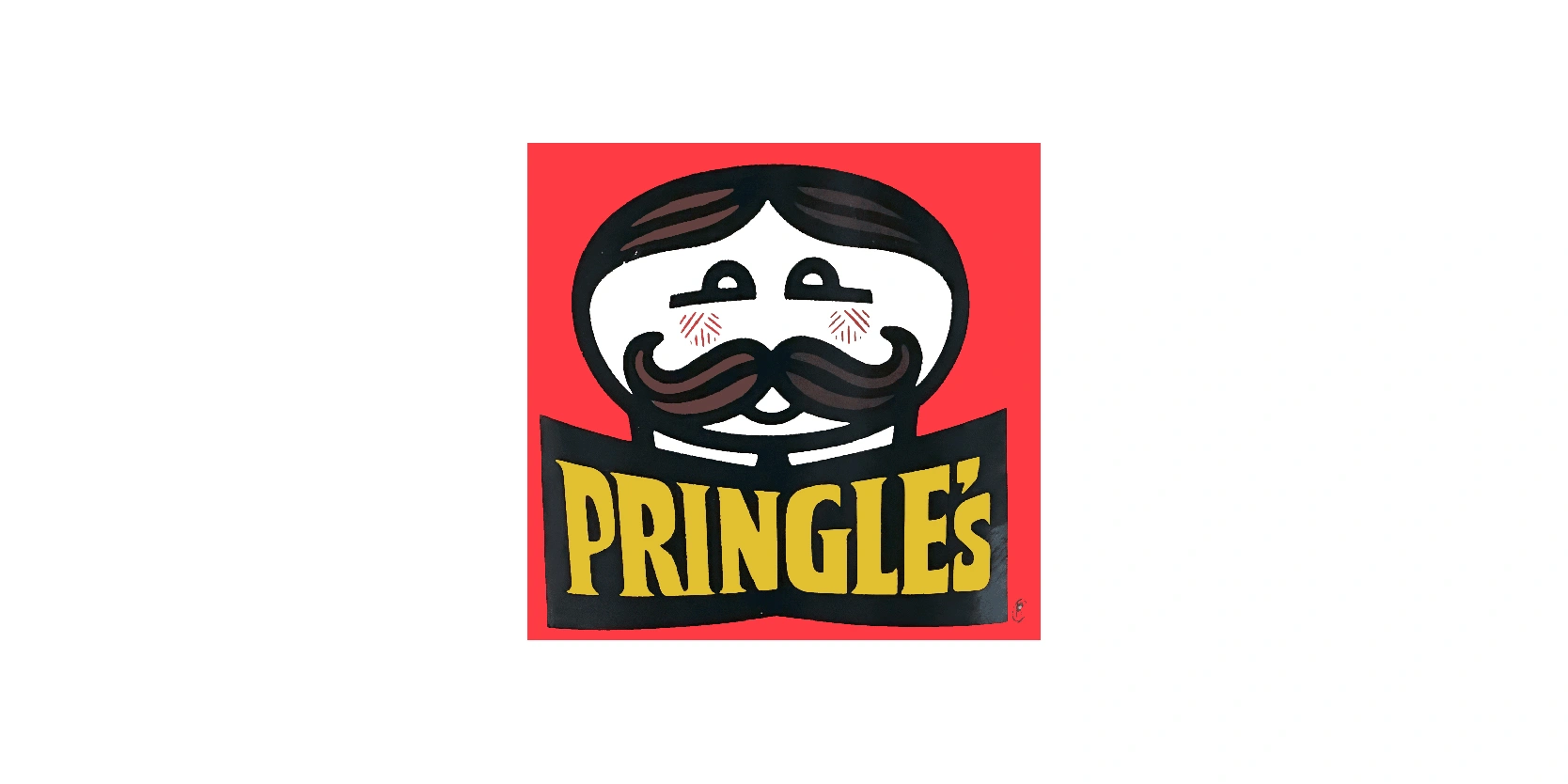
Between 1980 and 1986, the Pringles logo underwent its first significant redesign while keeping “Mr. Pringle” as the central mascot. During this period, his appearance was slightly modernized: the mustache became more stylized, the eyes were simplified, and the bow tie was slightly reshaped to give him a cleaner, more contemporary look. The changes reflected broader design trends of the early 1980s, favoring simpler lines and a more polished cartoon style and now, including a red background as well.
The overall goal was to make the logo more visually appealing on supermarket shelves while maintaining the friendly, approachable personality that had defined the brand since its launch. This era also saw adjustments to typography and can design, ensuring that the Pringles brand remained recognizable and relevant. The typography now was colored in a stronger yellow color compared to the previous one that looked more washed out.
In short, the 1980–1986 logo helped solidify Mr. Pringle as an enduring mascot that could evolve with changing tastes.
1986-1996
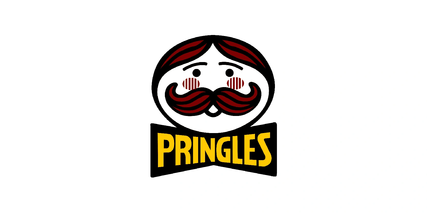
From 1986 to 1996, the Pringles logo took on a brighter, more dynamic look that reflected the fun and playful spirit of the brand. “Mr. Pringle” was redrawn with bolder lines, larger eyes, and a fuller, curved mustache that gave him a more animated personality. In this logo version, they removed the bow tie and gave him eyes that were black dots instead of white eyes with black lines at the bottom. Right below the eyes, you’ll see that red and white lines were drawn to make the logo more unique from other years, and to shape Pringles logo and brand personality.
Alongside the mascot, the wordmark was updated with lively, slanted lettering in a warm yellow color palette, reinforcing the energetic, snack-time appeal of the brand. Alongside the crisp yellow wordmark, still remains the black background, but seemed to appear much smaller compared to other years.
This redesign was closely tied to Pringles’ growing popularity worldwide, helping the product stand out on store shelves and in advertising campaigns. The 1986–1996 version was one of the most recognizable stages of the logo’s evolution, cementing Mr. Pringle as a household character and making the branding more engaging for a global audience.
1996-2002
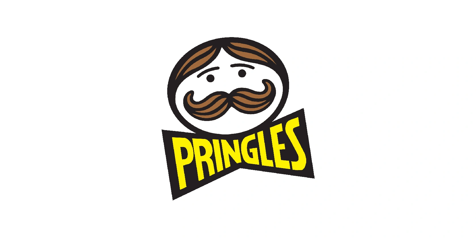
The Pringles logo from 1996 to 2002 introduced a more polished and modernized version of “Mr. Pringle,” reflecting the brand’s global expansion and updated marketing approach. His face was redrawn with smoother outlines, giving him a sleeker and friendlier appearance compared to all previous logo designs.
The mustache became more symmetrical and refined, removing the line in between the mustache held in the previous logo. The wordmark remained the same color, but it was slightly tilted to match the face of Mr Pringles. The red and white lines below the eyes were removed, most likely because logo design trends were changing and Pringles wanted to stay updated. The colors during this era: yellow, and black, were vivid and eye-catching, designed to grab attention on supermarket shelves and appeal to younger audiences.
This redesign balanced tradition with modernity, keeping Mr. Pringle’s familiar charm while giving him a fresher look for the late 1990s. The 1996–2002 logo reinforced Pringles as a fun, international snack brand with a consistent and memorable identity.
2002-2009
The 2002–2009 Pringles logo marked one of the most dynamic redesigns in the brand’s history, giving “Mr. Pringle” a bold, playful makeover. His face was redrawn with larger, more expressive eyes and a fuller, stylized brown mustache that made him appear livelier and more cartoonish.
The iconic red bow tie was introduced again after some time, but it was placed above a striking new element: a bright red background shape resembling an abstract chip or ribbon, which added movement and energy to the design.
The word “Pringles” appeared in a bold yellow font with a thick black outline, tilted slightly to create a sense of fun and excitement. This version embraced vibrant colors and exaggerated features to appeal to a younger, global audience, emphasizing the snack’s playful character. The 2002–2009 logo successfully refreshed the brand while keeping Mr. Pringle’s recognizable identity intact.
2009-2020
The Pringles logo introduced in 2009 simplified and modernized “Mr. Pringle” while keeping his most iconic features. The design removed the bold red background shape used in the previous version, allowing the mascot and wordmark to stand on their own with a cleaner and more minimal look. Mr. Pringle’s mustache became smoother and slightly darker, while his eyes and brows were streamlined for a friendlier, less exaggerated expression.
His red bow tie remained as a key detail, anchoring the wordmark directly beneath his face. The “Pringles” text stayed in its bold yellow font with a thick black outline, but it appeared more refined and balanced within the logo. This redesign reflected broader design trends of the 2010s, prioritizing simplicity and digital adaptability, ensuring the brand could remain recognizable across packaging, advertising, and online platforms.
2020-2021
In 2020, Pringles introduced a bold redesign of its logo, marking one of the most dramatic updates in the brand’s history. Mr. Pringle received a minimalist makeover, with his features flattened into a modern, digital-friendly style. His hair was completely removed and only his eyebrows remained. His iconic mustache became a cleaner, two-tone graphic. Notably, his eyebrows were the “replacement” for his hair, giving him a fresher and less cartoonish look.
The red bow tie was retained but streamlined, maintaining a connection to earlier versions. The “Pringles” wordmark stayed in bold yellow with a black outline, but the overall design shifted toward simplicity and versatility. This pared-down look was created to align with modern branding trends, ensuring the logo looked sharp across packaging, mobile apps, and social media. The 2020–2021 version set the stage for the brand’s most current identity while preserving its familiar charm.
2021-present
The 2021 Pringles logo refined Mr. Pringle even further, giving the mascot a clean, flat design that reflects the modern wave of minimalism in branding. His features were simplified to just eyes, eyebrows, and mustache, removing the bow tie, and shading and gradients in favor of bold, flat colors.
The mustache is thicker and more geometric. The wordmark “Pringles” wordmark was redesigned, after such a long time, in white lettering, providing a fresh twist on a long-standing detail.
This version embraced a two-dimensional look that works seamlessly across digital platforms, packaging, and marketing campaigns. Despite its simplified style, the 2021 logo preserves Mr. Pringle’s charm while making the design more versatile and contemporary. It represents the brand’s commitment to staying relevant in a fast-changing visual landscape while keeping its heritage alive.
Pringles has held up very well
The history of the Pringles logo shows how a simple mascot can evolve while keeping its core identity intact. Since Mr. Pringle first appeared in 1967, he has undergone multiple redesigns, sometimes playful and cartoonish, other times sleek and minimal, but he has always remained the smiling face of the brand.
Each change reflected the design trends of its era, from bold colors and exaggerated features in the early years to the clean, flat minimalism of today. What makes Pringles’ logo journey unique is the balance between innovation and familiarity: the brand continues to refresh its image without losing the character that makes it so recognizable.
More than just a design evolution, the Pringles logo tells the story of how a snack brand grew into a global icon, proving that even the smallest details like a mustache and bow tie can leave a lasting good impression.
