The Porsche logo is more than just a badge, it’s a symbol of heritage, precision, and timeless design. Since its introduction in 1952, the crest has become one of the most recognizable emblems in the automotive world, embodying both the brand’s German roots and its commitment to performance.
Over the decades, it has evolved subtly to suit modern design trends while retaining its iconic essence. Exploring its history, evolution, and legacy reveals not only how Porsche built its powerful visual identity but also how the logo became a lasting emblem of speed, innovation, and prestige.
That being said, let’s find out more about its logo design history.
Meaning and history
Porsche is a company brand that values both mixes and traditions alongside innovations. Introduced in 1952, the crest combines elements that reflect both the brand’s origins and values. At its center sits the prancing horse, derived from the city seal of Stuttgart, where Porsche’s headquarters are located.
This horse represents strength, speed, and agility, qualities deeply tied to Porsche’s engineering philosophy. Surrounding it is a golden shield adorned with black and red stripes and antlers, borrowed from the coat of arms of the former Kingdom of Wittenberg, paying tribute to regional pride.
The word “Porsche” sits prominently at the top, reinforcing the brand’s identity. Over the decades ,the logo has undergone only subtle refinements, preserving its historic symbolism while maintaining modern appeal. Today, it stands not only as a badge of luxury sports cars but also as a global icon of innovation, excellence, and timeless design.
1922-1945
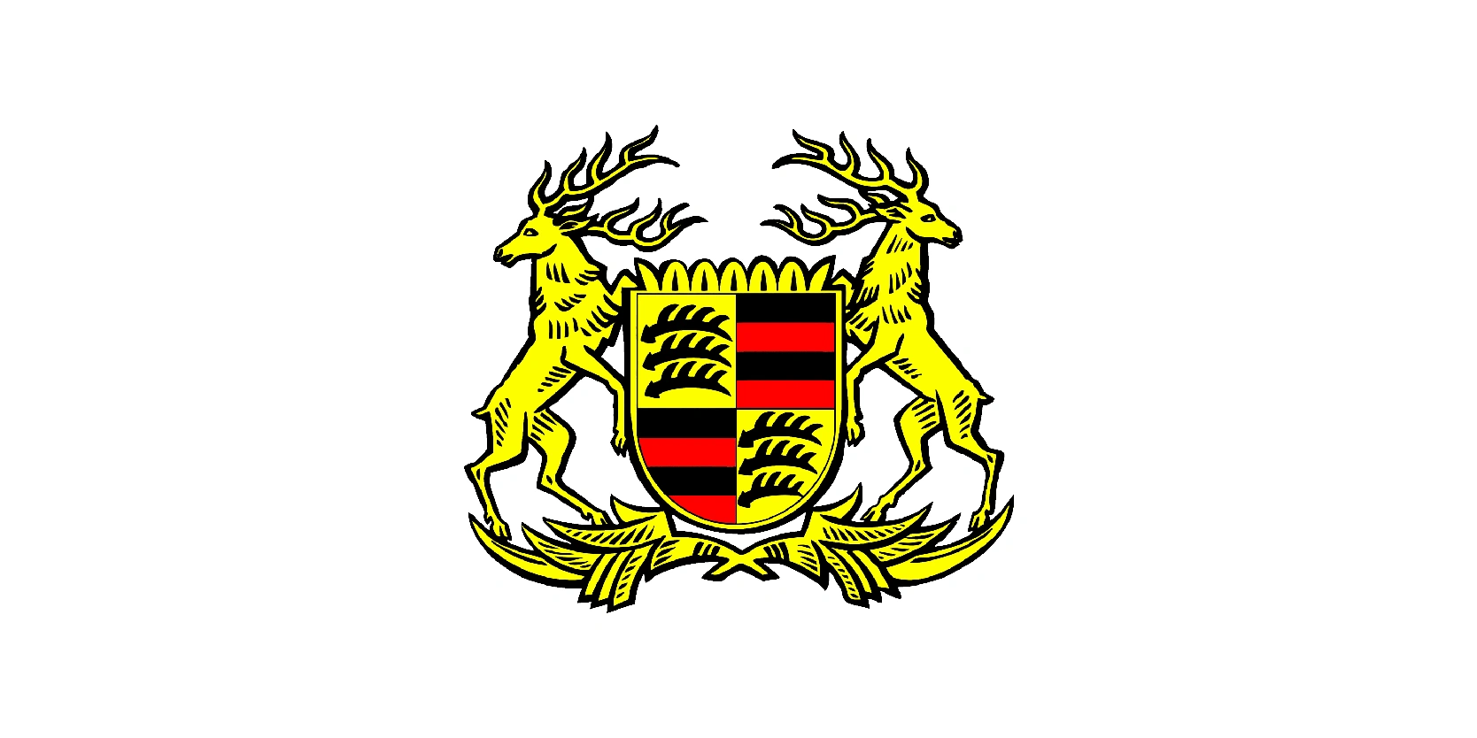
The very first Porsche logo, used between 1922 and 1945, was not the famous crest we recognize today, but a coat of arms-inspired design. Strongly rooted in regional identity, it featured elements from the Wurttemberg state coat of arms, where Porsche’s headquarters were located. At its center sat a shield divided into red and black stripes with stylized antlers, symbolizing the region’s heritage.
The shield was flanked by two golden stags, reinforcing themes of strength, tradition, and nobility.
Unlike the later Porsche crest introduced in the 1950s, this emblem was more formal, resembling a traditional heraldic symbol rather than a modern automotive logo.
1938-1948
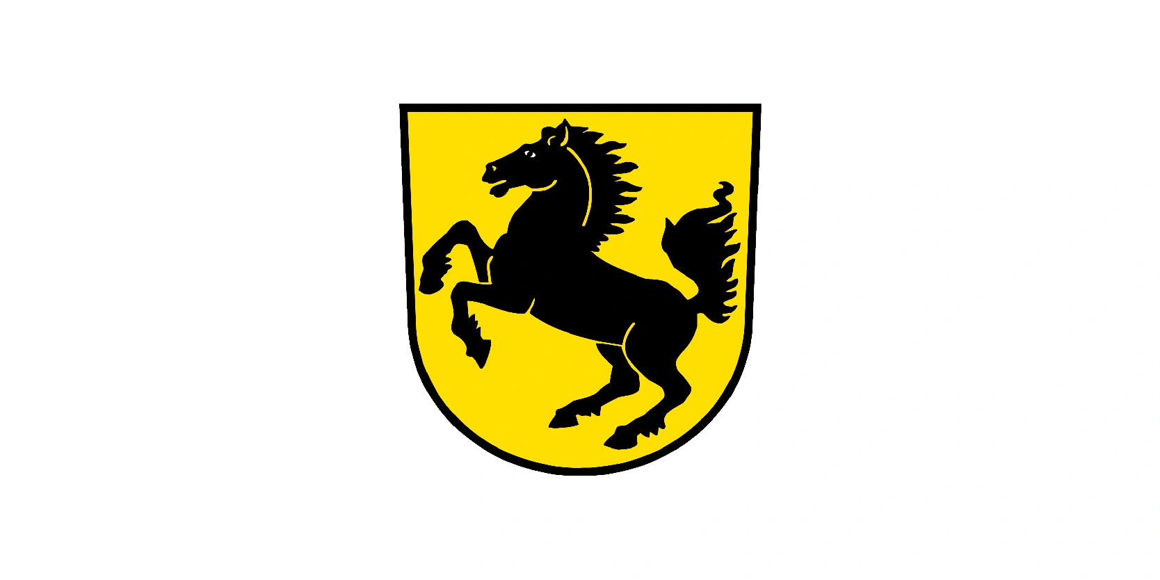
The second Porsche logo, used between 1938 and 1948, moved closer to the imagery we associate with the brand today. This emblem featured a black prancing horse on a golden shield, directly inspired by the coat of arms of Stuttgart, the city where Porsche was founded and remains headquartered. The horse symbolized power, agility, and speed, qualities that aligned perfectly with Porsche’s engineering vision.
Unlike earlier heraldic design with stags and regional motifs, this logo was simpler, bolder, and far more modern. It reflected a transition from a traditional coat of arms to a logo that could stand on its own as a brand identity. The golden background emphasized prestige and quality, while the prancing horse conveyed motion and dynamism, traits essential to automotive performance.
This design became a vital stepping stone toward the final Porsche crest of the 1950s, firmly rooting the company’s identity in its Stuttgart origins and projecting an image of refined power and innovation.
1948-1952
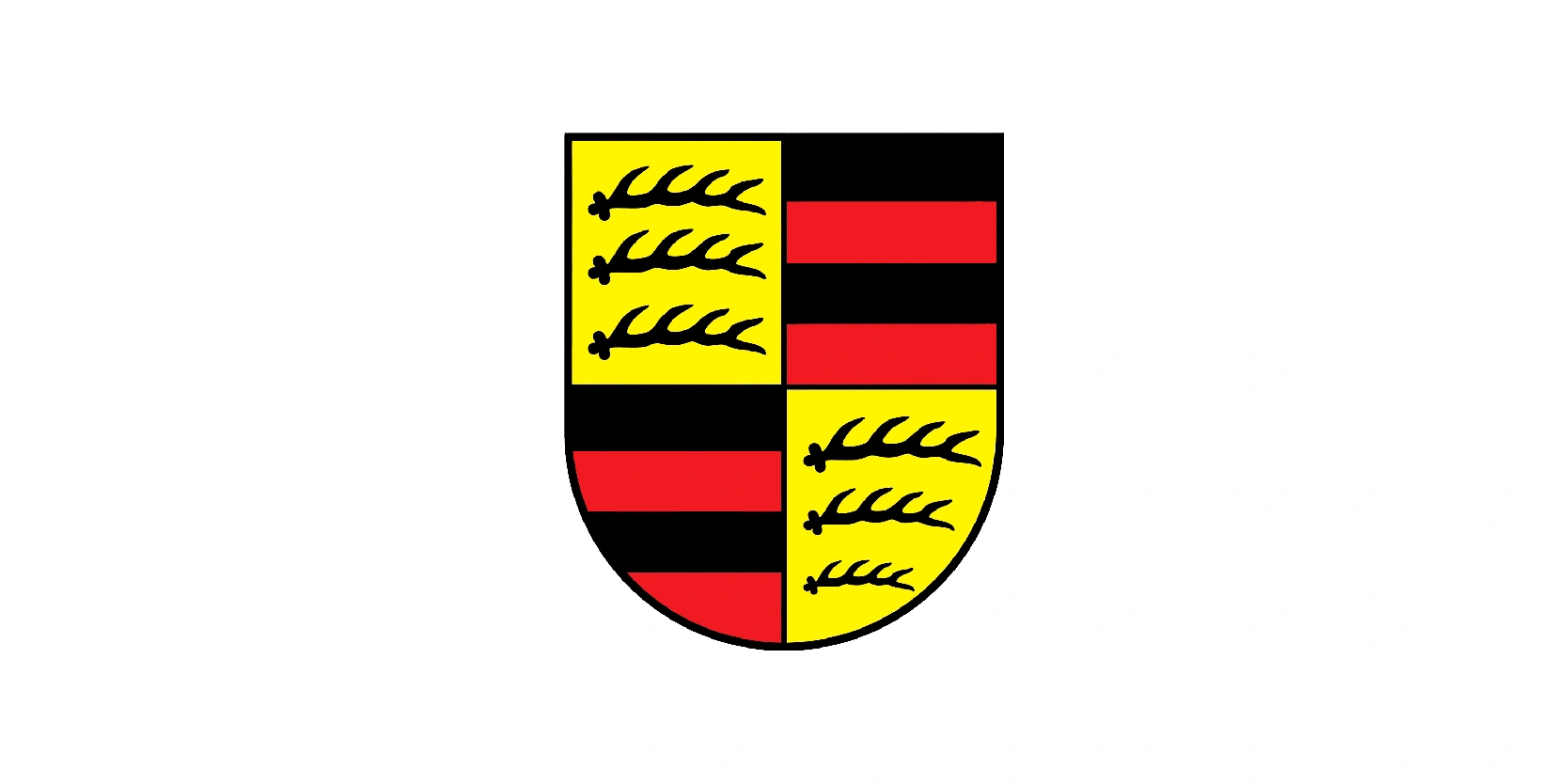
The Porsche logo used between 1948 and 1952 was a minimalist yet significant emblem in the company’s history. This period marked the official founding of Porsche as a car manufacturer, following the creation of the Porsche 356, the brand’s first production model. Instead of a complex heraldic design, Porsche adopted a simple wordmark-style logo, often just the name “Porsche” spelled in capital letters with clean, modern typography.
This stripped-down approach reflected the company’s focus on establishing itself in the post-war automotive industry, where clarity and recognition were crucial. Without ornate symbols or regional coats of arms, the emphasis was placed directly on the Porsche name, allowing the brand itself to speak for performance, innovation, and exclusivity.
Though temporary, this wordmark set the stage for the more iconic crest introduced in 1952. It served as a transitional identity, bridging Porsche’s regional heritage with its ambitions of becoming a world-renowned sports car manufacturer.
1952-1963
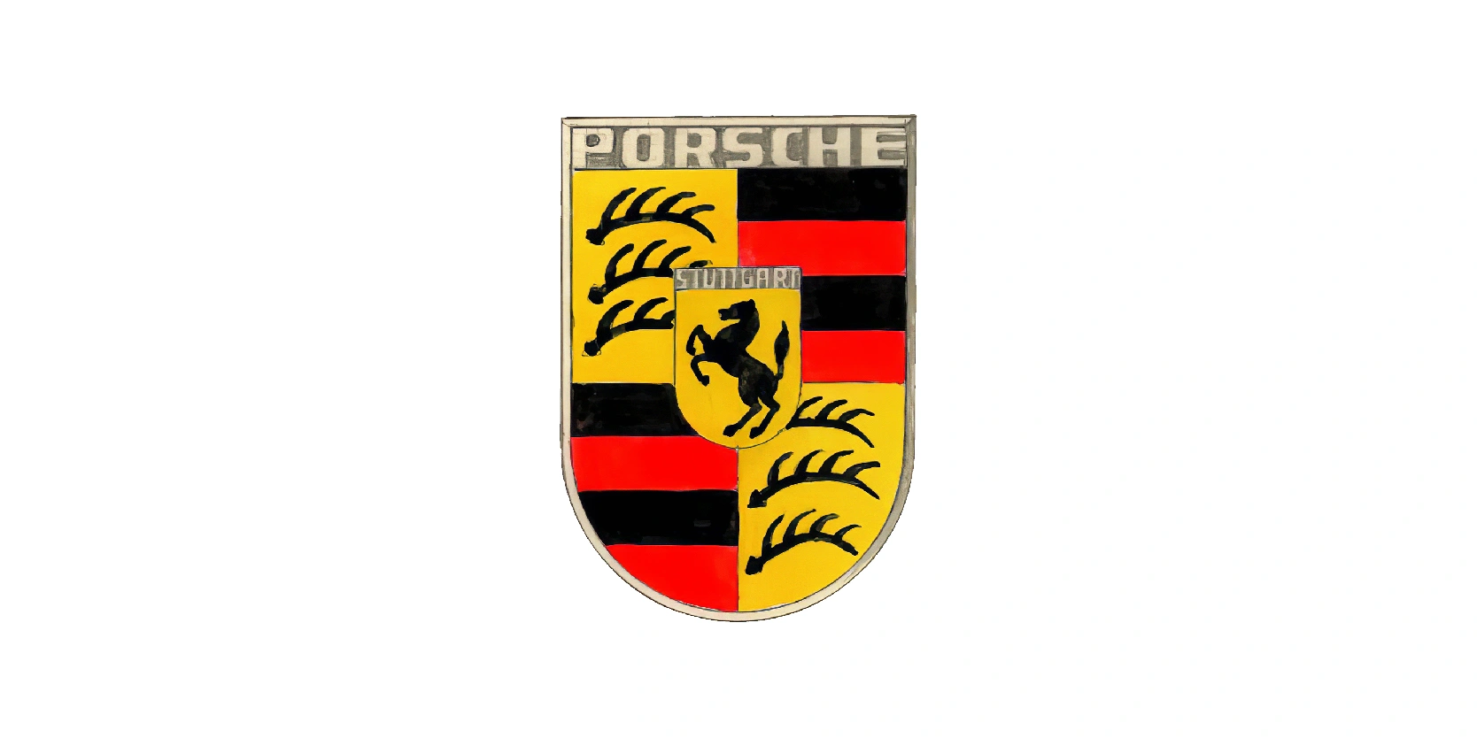
The Porsche logo was introduced in 1952 and used until 1963 marked the debut of the brand’s now-iconic crest design, which has remained the foundation of Porsche’s identity ever since. This emblem combined elements from both the Wurttemberg state coat of arms (The red and black stripes with antlers) and the Stuttgart city crest (the black prancing horse on a golden shield). At the top of the crest, the name “Porsche” was prominently displayed, while “Stuttgart” appeared at the center, reinforcing the company’s roots.
This was the first time Porsche had a logo that fully represented both its geographical heritage and its performance-driven philosophy. The horse symbolized speed and power, while the antlers and stripes highlighted tradition and regional pride.
Bold, detailed, and instantly recognizable, this crest Porsche had a powerful visual identity that aligned perfectly with its rising reputation in motorsport and luxury sports cars during the 1950s.
1963-1994
The Porsche logo used between 1963 and 1994 retained the iconic crest introduced in 1952 but featured subtle refinements that gave it a more modern and polished appearance.
The overall structure remained the same: the golden shield divided into four quadrants with the red-and-black stripes and antlers of Wurttemberg, and the bold black prancing horse in the center representing Stuttgart.
The words “Porsche” at the top and “Stuttgart” in the center continued to emphasize both the brand’s name and its heritage.
During this period, the crest’s colors became richer and more vibrant, with deeper gold tones and sharper detailing, which helped it stand out more prominently on Porsche vehicles. This era also coincided with Porsche’s global expansion and the rise of legendary models such as the 911, cementing the crest as a symbol of prestige, speed, and engineering excellence.
By 1994, the logo was firmly established as one of the most recognizable and respected emblems in the automotive world.
1994-2014
The Porsche logo used from 1994 to 2014 was a refined evolution of the classic crest, designed to give it a more luxurious and contemporary feel. The layout remained unchanged, preserving the iconic elements: the black prancing horse of Stuttgart in the center, surrounded by the red-and-black stripes and antlers of Wurttemberg, all contained within the golden shield. The words “Porsche” across the top and “Stuttgart” in the middle continued to anchor the brand’s identity.
What distinguished this version was its more polished, three-dimensional look. The gold background took on a richer, metallic tone, while the red and black details were given stronger contrast for a sharper finish. Subtle shading and embossed effects made the crest appear more dynamic and premium, perfectly aligning with Porsche’s growing image as a producer of high-performance sports cars and luxury vehicles.
This logo accompanied the rise of iconic models like the Boxster, Carrera GT, and Cayenne, further cementing Porsche’s global prestige.
2014-2023
The Porsche logo used between 2014 and 2023 was a modernized version of the famous crest, updated to reflect Porsche’s luxury status in the 21st century. While the core design remained untouched, the golden shield, Wurttemberg’s red-and-black stripes with antlers, and the prancing Stuttgart horse, the finish was significantly enhanced.
This version introduced a sleeker, high-gloss look with sharper embossing and a more pronounced 3D effect. The gold tone became brighter and more metallic, the red stripes were deepened, and the black elements gained a glossy enamel-like finish. The lettering of “Porsche” and “Stuttgart” was also more refined, giving the crest a premium and highly detailed appearance.
Used on all Porsche models during this period, this logo symbolized the brand’s blend of tradition and cutting-edge innovation. It reflected Porsche’s evolution into not just a sports car icon but also a leader in luxury SUVs and hybrid technology, bridging heritage with modern performance.
2023-present
The current Porsche logo, introduced in 2023 and still in use today, represents the most refined version of the brand’s legendary crest. While the overall design remains faithful to the original 1952 concept, this update emphasizes modern minimalism and precision detailing. The prancing horse of Stuttgart in the center has been sharpened with a bolder, more dynamic outline, while the antlers and red-and-black stripes of Wurttemberg are rendered with a flatter, more contemporary texture.
A key change is the introduction of a brushed metal effect on the gold areas, replacing the glossy 3D shine of the previous version. The red stripes now feature a subtle honeycomb texture, adding depth without overwhelming the design. The lettering of “Porsche” and “Stuttgart” has also been streamlined for a cleaner, more modern look, optimized for both physical badges and digital applications.
This latest crest reflects Porsche’s push toward electrification, digital innovation, and timeless luxury, balancing heritage with future-focused identity.
Everything you need to know
This Porsche logo has endured for more than seven decades because it strikes the perfect balance between heritage and innovation. From its early heraldic inspirations to the sleek, refined crest of today, each redesign has honored Porsche’s Stuttgart roots while adapting to modern design standards.
The consistent presence of the prancing horse and Wurttemberg’s symbols ensures that the crest remains instantly recognizable, a visual shorthand for performance, craftsmanship, and prestige.
More than just an emblem, the Porsche logo embodies the brand’s legacy of engineering excellence and its ongoing drive toward the future. Its evolution reflects Porsche's journey, from a small sports car maker to a global icon of luxury and innovation, ensuring that the crest will remain a timeless symbol of speed and distinction.
