The Subway logo has become one of the most recognizable in the fast food industry, but it didn’t get there overnight. Over the past 50+ years, Subway has gone through many logo redesigns, each reflecting the brand’s growth and evolving identity.
From its humble beginnings as a small sandwich shop in 1965 to its global presence today, Subway’s logo has shifted from utilitarian letting to a fresher and more dynamic design.
In this article, we’ll dive deeper into learning more about the logo design history of Subway and what changed in half a century.
The debate: 1965-1968
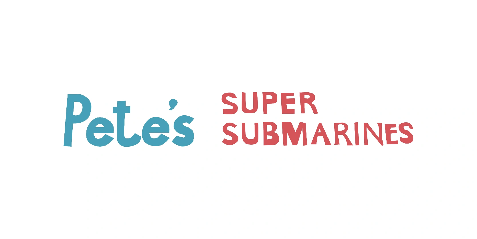
Many might not know this, but Subway didn’t actually start with the name it has today. The image shows the original logo of Pete’s Super Submarines, the predecessor to what we now know as Subway. Created in 1965, this early logo reflects the brand’s humble beginnings as a small sandwich shop founded by Fred DeLuca and funded by family friend Dr. Peter Buck, hence the name “Pete’s.” The logo features a playful mix of sky blue and bold red text, with a casual, hand-drawn feel that communicates approachability and simplicity.
While it lacks the polish and visual identity we associate with the Subway brand today, this early logo captures the spirit of a small, local business aiming to serve quality submarine sandwiches. The typography is varied and informal, which added charm but also made it visually unbalanced, a detail that would soon be refined as the business grew. This design laid the groundwork for a global rebranding that would begin just a few years later.
Wordmark change: 1968-1970
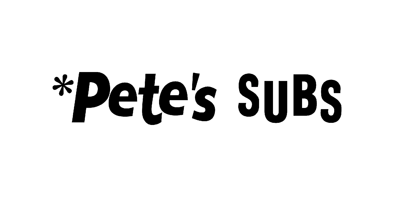
This image represents the 1968-1970 logo of what was when transitioning from Pete’s Super Submarines to simply Pete’s Subs, a key moment in the early history of the Subway brand. This version is much cleaner and more refined than its predecessor. The design features a bold, black, all-caps “SUBS” paired with a friendlier, rounded “Pete’s” in lowercase, creating a balance between approachability and professionalism.
One notable element is the use of the * sign before “Pete’s”, which adds a memorable touch, though its specific meaning was never clarified. The logo’s black-and-white palette reflects a no-frills, straight to the point identity, ideal for a brand that was still small but beginning to streamline its image.
This logo was short-lived but important, representing a stepping stone between the brand’s modest beginnings and its eventual rebrand into Subway, which would take place just a couple of years later.
Subway introduced: 1970-1972
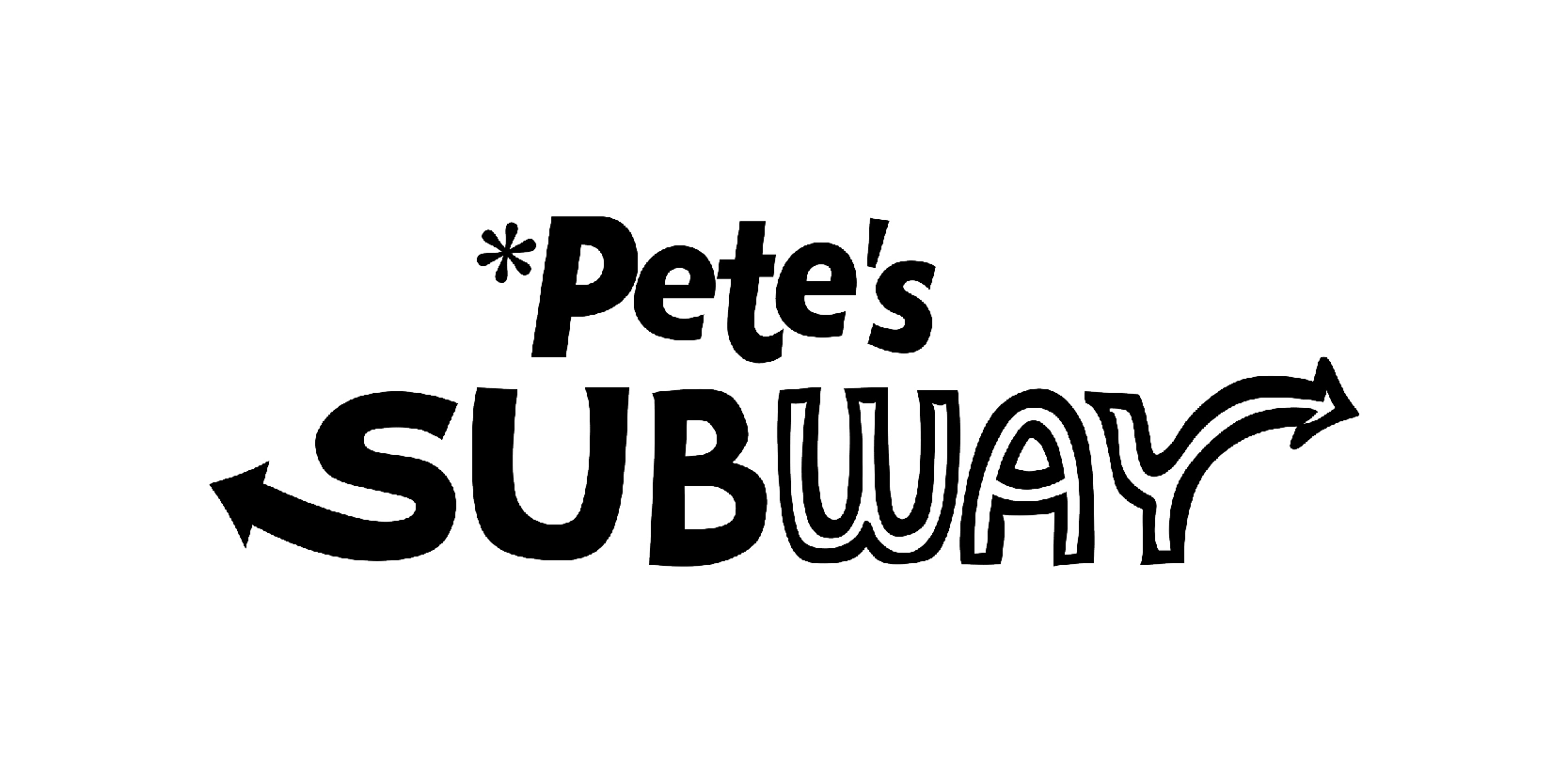
This image represents the 1970-1972 logo for the brand, now evolving into Pete’s Subway, the final transitional phase before it officially became just Subway. The most notable change in this design is the introduction of the iconic arrows at both ends of the word “SUBWAY,” which symbolized movement, direction, and speed, an early nod to the fast-service model the brand was refining.
The typography is playful and dynamic, with the “SUBWAY” portion using a combination of thick, rounded letters and stylized forms. The “U” and “W” stand out with their wave-like curves, adding energy and uniqueness. The asterisk remains next to “Pete’s,” a quirky element still carried over from the previous logo.
Though short-lived, this logo was pivotal. It introduced visual elements, especially the directional arrows that would become core to Subway’s brand identity for decades to come. It marked a creative leap toward the recognizable fast-food giant we know today.
Just Subway: 1972-1973
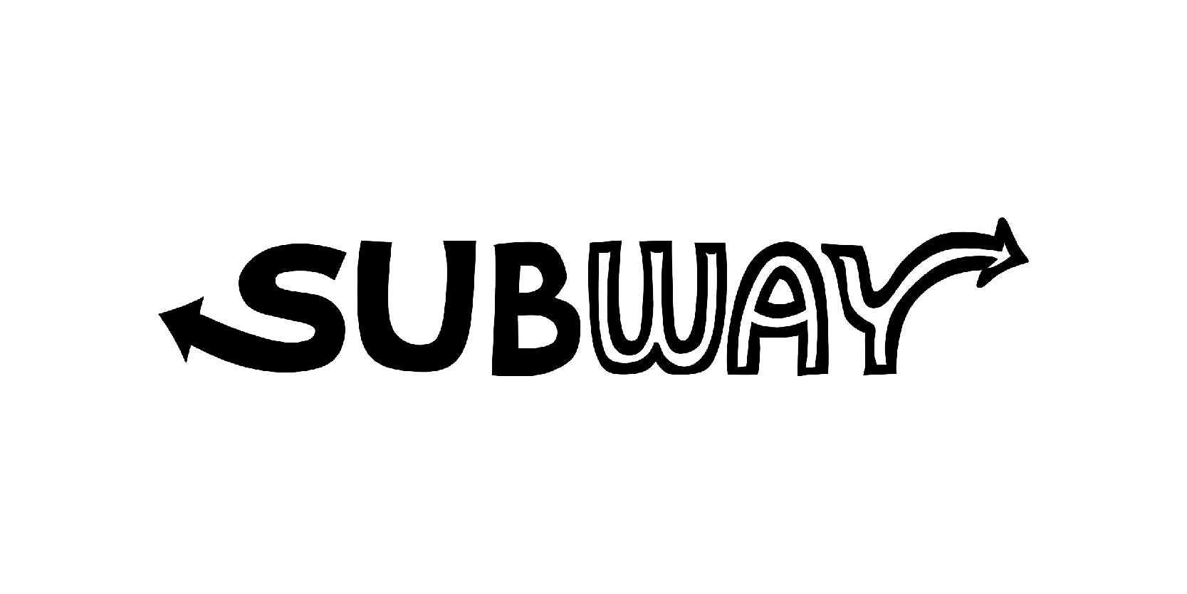
The 1972-1973 marked a pivotal moment in the brand’s evolution, from a local sub shop to a growing franchise. During this time, the company officially dropped “Pete’s” and fully embraced the name Subway, setting the stage for national recognition. The branding took a cleaner and more modern turn, simplifying the identity while retaining the distinctive arrow-tipped letters introduced in the prior version.
This iteration likely emphasized bold, blocky text with stylized arrows on the “S” and “Y”, symbolizing movement, direction, and the concept of a “Subway” system, fast, direct, and efficient. The font was streamlined for clarity and readability, reflecting the brand’s intent to become more professional and scalable.
Overall, the 1972-1973 logo acted as a bridge between experimentation and long-term identity. It was a confident step toward the Subway logo that would soon become iconic around the world.
More modern look: 1973-2002
The 1973-2002 Subway logo marked the company's first long-term and widely recognized visual identity. This version fully established Subway as a standalone brand, with the name in bold uppercase letters (Except for “W”) and distinctive arrows extending from the “S” and “Y.” These arrows represented entry and exit, cleverly playing on the idea of movement, speed, and the subway transportation system, which aligned with the brand's promise of fast, fresh, and food.
The typography became more refined and professional compared to previous versions, with a solid, sans-serif font that projected confidence and brand maturity. The color palette often appeared in green and yellow, symbolizing freshness and energy, two values Subway wanted to associate with its growing line of customizable sandwiches.
No black background: 2002-2016
The 1973-2002 Subway logo marked the company’s first long-term and widely recognized visual identity. This version fully established Subway as a standalone brand, with the name in bold uppercase letters, including the “W” now, too. The two colors still remained the same, but with a refined typography.
The color palette appeared in green and yellow, symbolizing freshness and energy— two values Subway wanted to associate with its growing line of customizable sandwiches.
This logo served Subway for more than 10 years, and helped it become a fast-food leader.
Green logo: 2015-2016
The 2015-2016 was a great logo design that sadly wasn’t extended for too long. It only lasted one year. This was because Subway tried to take a modern and minimalistic approach on the brand’s classic design. The wordmark was presented entirely in green, signaling a stronger emphasis on health, freshness, and natural ingredients, values Subway had been leaning into as consumer preferences shifted.
The font was simplified and softened slightly, giving the brand a more approachable and contemporary feel. By dropping the traditional yellow-green dual-color scheme and going fully green, Subway aligned its visual identity with its evolving mission to provide better, and healthier fast food.
Even though it was short-lived, this logo acted as a transitional design, preparing the brand for its next big visual update while reflecting its attempt to reconnect with modern consumers.
The modern logo: 2016-present
The 2016- present Subway logo marks a bold and polished evolution of the brand’s identity. From 2016. Subway decided to return to the iconic green and yellow color scheme, where this redesign balances freshness and energy.
The logo features a custom rounded sans-serif wordmark that feels approachable, confident, and versatile across digital and physical platforms. The arrow on the “S” and “Y,” a staple in Subway’s branding for years remain, but with a sleeker look. These arrows symbolize movement, direction, and choice, reflecting Subway’s core brand message of customization and freshness.
Green continues to represent health, vitality, and freshness, while yellow adds warmth, optimism, and accessibility. Together, the color palette supports the brand’s promise to deliver fresh, fat, and flavorful food.
Launched during a period of broader brand and menu transformation, the 2016 logo update helped Subway reposition itself in an increasingly competitive fast-casual market. By embracing minimalism and modernity while staying true to its roots, the current Subway logo strikes a balance between legacy and innovation, a smart move in branding longevity.
The logo design history reflects more than just visual evolution
Yes, you read it right, the logo design history of Subway reflects more than just visual evolution, it tells the story of a brand that has grown, adapted, and modernized over the course of five decades.
From its humble beginnings as Pete’s Super Submarines to the clean, confident wordmark we see today, each logo redesign marked a shift in the company’s identity, goals, and audience engagement. While the core elements, arrows, fresh colors, and bold typography have remained consistent, their execution has become more refined, aligning with changing design trends and consumer expectations.
Subway’s journey demonstrates the power of thoughtful logo evolution in maintaining brand relevance without losing its core essence. As the brand continues to expand globally, its logo stands out as a visual symbol of freshness, choice, and enduring appeal.
