The BMW logo is one of the most recognizable emblems in the automotive world, symbolizing luxury, performance, and engineering precision. Its design has remained remarkably consistent over more than a century, yet subtle updates and clever branding have kept it fresh and relevant.
From its origins rooted in Bavaria’s aviation heritage to its modern iterations that balance tradition with sleek minimalism, the BMW logo tells a story of innovation and identity.
In this article, we’ll show you what you need to understand and what’s the evolution of this iconic emblem and the company’s design philosophy.
Rapp Motor: 1913-1917

BMW’s first logo, introduced in 1917, laid the foundation for one of the most iconic automotive symbols in history. At first glance, it featured a simple yet striking circular design, divided into quadrants with alternating black and white colors. These colors honored the company’s roots in Bavaria, Germany, but of course, were in black and white at first.
This early emblem symbolized more than just the company’s name at the time “Rapp Motor,” it represented precision, engineering excellence, and the pioneering spirit of aviation, as BMW initially focused on aircraft engines.
Interestingly, the logo’s design has often been interpreted as a spinning propeller in motion, linking it to BMW’s aeronautical origins, though this was a later popular association. Despite over a century of evolution, the 1917 logo’s core design elements, circular form, color scheme, and simplicity, remain central to BMW’s visual identity today even though it debuted with a different name.
The start of BMW: 1917-1936
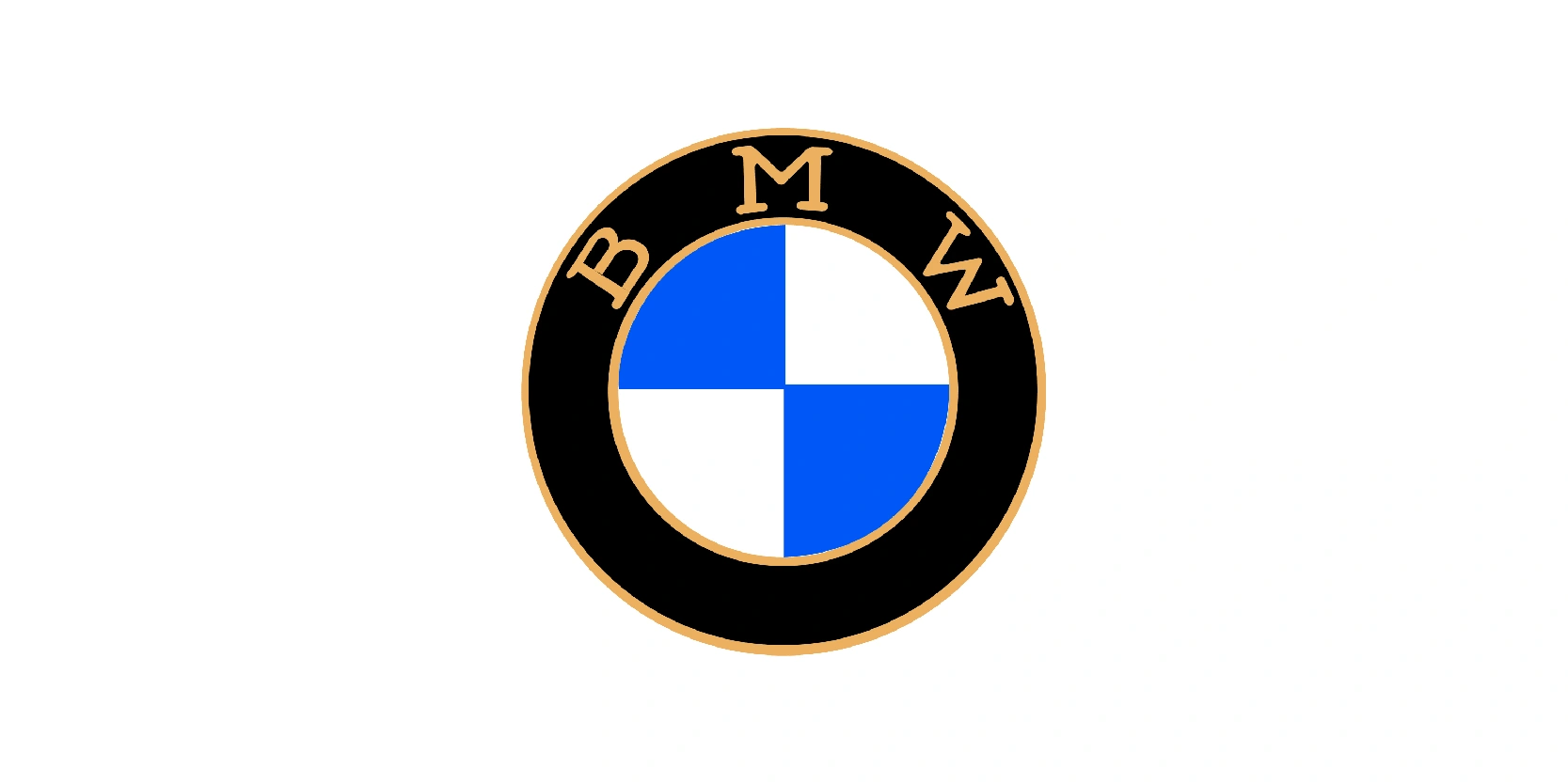
This version of the BMW logo dates back to the company’s early years, specifically between 1917 and 1936. It was introduced after BMW was founded from the restructuring of Rapp Motorenwerke, a German aircraft engine manufacturer.
The design kept a circular format but adopted a more distinct style: The black outer ring featured the gold-colored “BMW” lettering, while the inner circle displayed the now-famous blue and white quadrants, representing the Bavarian state colors.
Contrary to a popular myth, the design was not originally intended to depict a spinning aircraft propeller; that interpretation only became widespread in the late 1990s due to advertising campaigns.
During the 1917-1936 period, BMW focused primarily on aircraft engines, then expanded into motorcycles and eventually automobiles. This logo symbolized the company’s Bavarian roots and engineering heritage during its formative decades in a rapidly changing industrial era.
From secondary to primary: 1923-1953
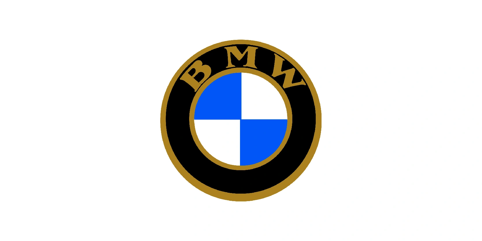
This BMW logo version was used from 1923 to 1953, marking a period of significant transformation for the company. It retained the iconic black outer ring with gold “BMW” lettering and the blue-and-white inner quadrants symbolizing Bavaria. Compared to the 1917-1936 version, the gold tone here is richer and the font slightly bolder, giving the emblem a more solid, authoritative presence.
The logo accompanied BMW’s evolution from a producer of aircraft engines to a diversified manufacturer of motorcycles and automobiles. In the early 1920s, BMW introduced its first motorcycle, the R32, which became a cornerstone of the brand’s engineering reputation.
The 1930s saw expansion into luxury and sports cars, while the post-World War II years brought challenges due to destruction of facilities and restrictions on production. This emblem stood as a constant through decades of innovation, hardship, and recovery, embodying both Bavarian heritage and BMW’s growing global ambitions.
Modern colors: 1936-1963
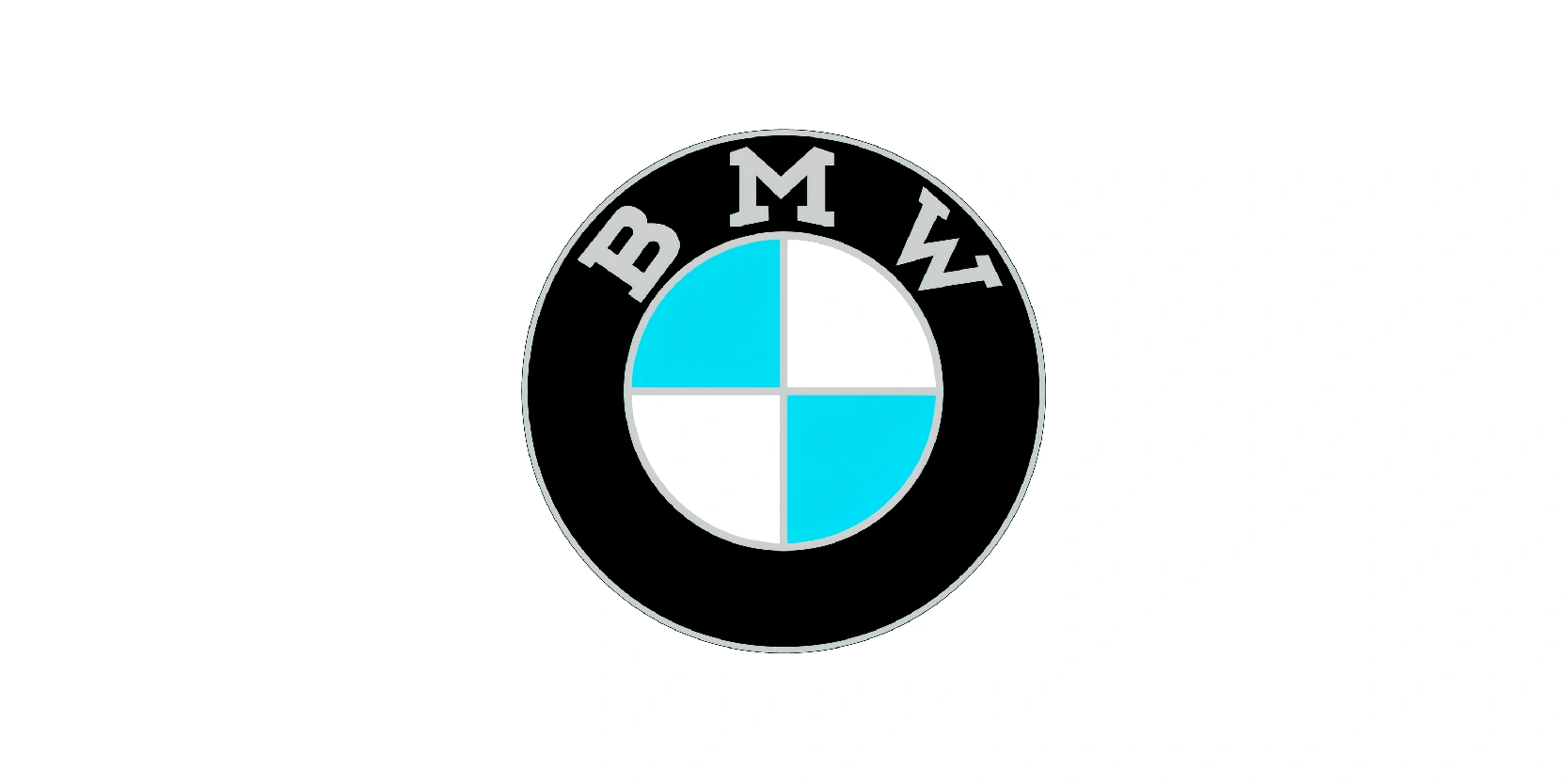
This BMW logo version was in use from 1936 to 1963, reflecting the company’s growth and modernization during an eventful era. The design evolved from earlier versions by adopting a cleaner, more refined look. The black outer ring now carried silver-gray “BMW” lettering, replacing the previous gold accents.
Inside, the iconic quadrants were kept, but the blue tone became lighter, closer to sky blue, paired with white to represent the Bavarian flag. This period covered BMW’s transition from a focus on aircraft engines and motorcycles to becoming a recognized automobile manufacturer. The 1930s saw the introduction of elegant sports cars like the BMW 328, practical cars such as the BMW Isetta.
Despite some hardships it had, this logo remained a symbol of endurance, progress, and Bavarian pride, standing strong through decades of challenge and reinvention.
Modernizing the BMW logo: 1963-1997
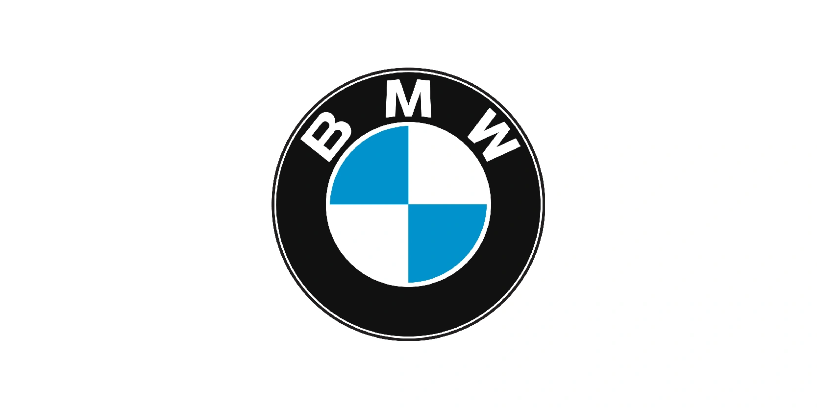
The BMW logo used between 1963 and 1997 marked one of the company’s most iconic and long-lasting designs. This version kept the familiar elements, the black outer ring with the bold “BMW” letters and the central circle divided into blue and white quadrants, symbolizing Bavaria.
However, the design became more modern, with sharper lettering in white, a stronger contrast against the black background, and a brighter blue tone in the quadrants.
During this period, BMW rose to global prominence as a leading premium automobile manufacturer. The brand expanded its reputation with sporty sedans, coupes, and motorcycles, embodying the motto “Sheer Driving Pleasure.” Legendary models such as the BMW 3 series, 5 series, and the M performance line were introduced, cementing BMW’s image as a maker of vehicles blending luxury with dynamic performance.
This logo, unchanged for over three decades, became deeply associated with BMW’s identity as a symbol of engineering excellence and prestige.
Racing sport logo: 1970-1989
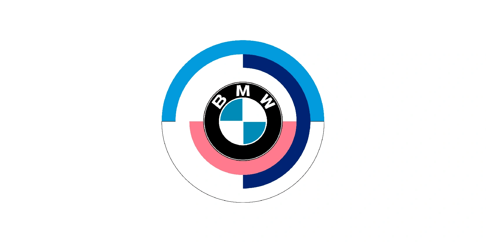
From 1970 until 1989, BMW decided to use a logo for racing and motorsport activities, rather than being the primary corporate emblem. While the standard BMW logo continued to appear on production cars, this motorsport-specific variation often appeared in contexts such as:
- BMW Motorsport GmbH: Managed BMW’s racing programs from 1972.
- Touring car and Formula racing cars: Was used to emphasize BMW’s identity in competition.
- Special motorsport merchandise and promotional material.
The design remained consistent with the rational roundel but was often presented with slight stylistic tweaks to make it stand out more on race cars. In the same period BMW motorsport also introduced its now-famous tricolor stripes (blue, purple/red, and dark blue) which became another strong visual identity in racing.
3D effect: 1997-2020
The BMW logo used from 1997 to 2020 was a modernized version of the company’s classic roundel, updated to suit digital and print media of the late 20th and early 21st century. It retained the iconic layout: a black outer ring with bold white “BMW” lettering and the central quadrants in blue and white, representing the Bavarian flag.
What distinguished this version was the addition of a glossy 3D effect, with shading, highlights, and metallic silver outlines. This gave the logo a sleeker, more premium look, aligning with BMW’s positioning as a global leader in luxury and performance vehicles.
During this period, BMW expanded its lineup significantly, introducing popular models such as the X Series SUVs, the electric “i” sub-brand, and continuing the success of the 3, 5, and 7 series. The 1997-2020 logo became one of the most recognizable automotive emblems worldwide, symbolizing innovation, driving pleasure, and modern luxury.
Current logo: 2020-present

The current BMW logo, introduced in 2020 and still used now, represents a major shift in the brand’s visual identity. While it does keep the traditional roundel shape and the blue-and-white Bavarian quadrants, the design has been flattened and simplified for the digital era.
The black outer ring was removed, replaced by a transparent circle, allowing the logo to adapt seamlessly to different backgrounds. The letters “BMW” remain in white, but the overall style is now minimalist, clean, and two-dimensional, aligning with contemporary design trends.
BMW introduced this logo as part of its move toward electrification, digitalization, and sustainability, reflecting a future-oriented brand philosophy. It is used in corporate communications, digital platforms, and concept vehicles, while most production cars still carry the classic 3D version of their badges.
This logo symbolizes BMW’s transition into a new era, balancing its Bavarian heritage with modern innovation and forward-looking identity.
BMW has massively succeeded in its logo design history
The BMW logo has stood the test of time because it balances tradition with innovation. From its origins in 1917, inspired by Bavarian heritage, to its modern minimalist redesign in 2020, the roundel has continuously evolved to match cultural and tech shifts while staying instantly recognizable.
Each version tells part of BMW’s story, from aircraft engines to motorcycles, luxury cars, motorsport dominance, and now electric mobility.
Its enduring popularity lies in this consistency: No matter how the design has changed, the logo has always symbolized precision, prestige, and driving pleasure. More than just a badge, the BMW roundel has become a global icon of engineering excellence and forward-looking design.
