The Burger king logo is one of the most recognizable symbols in the fast-food industry, representing more than just a place to grab a burger, it’s a reflection of how the brand evolved over time. Since its founding in 1954, Burger King has experimented with different logo styles, from playful designs to bold modern updates, each capturing the spirit of its era.
These changes not only highlight shifts in branding trends but also mirror the company’s efforts to stay relevant in a competitive global market.
In this article, we’ll take a closer look at the logo design history of Burger King and uncover what has changed since its earliest days.
The beginning of a new era: 1953-1954
The 1953-1954 Burger King logo was the very first emblem used by the brand, marking the beginning of its visual identity. Unlike the colorful and playful designs that came later, this early version was simple, monochromatic, and more formal in appearance.
It featured a half-sun rising above the horizon, symbolizing freshness, a new day, and the idea of starting strong. Beneath the sun, the bold, black “BURGER KING” text in blocky, capital letters gave the logo a sense of authority and stability.
Although this design did not convey the fun and friendly image the chain later adopted, it reflected the brand’s attempt to establish itself as a strong and recognizable name in the fast-food industry during its early years.
A few changes: 1954-1957
The 1954-1957 Burger King logo took a completely different approach from the brand’s original design, focusing solely on typography. This version displayed the name “BURGER-KING” in bold, playful black letters with a unique, uneven style that gave the logo a quirky and eye-catching appearance. The use of a hyphen between the words added distinction, making the name stand out more clearly.
Compared to the previous sun emblem, this design felt less formal and more approachable, signaling a shift toward creating a friendlier identity for the growing fast-food chain. While still quite simple and lacking any imagery, the fun, cartoon-like lettering hinted at the brand’s evolving direction toward a more casual and family-friendly atmosphere that better matched its offerings.
Color introduction: 1957-1969
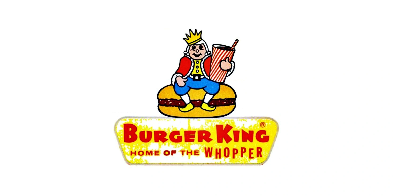
The Burger King logo from 1957 to 1969 is one of the most playful and character-driven versions in the brand’s history. It features a cartoonish king sitting on top of a large hamburger, proudly holding a soft drink in his hand.
The king, wearing a crown, colorful clothes, and a cheerful expression, was designed to symbolize fun, friendliness, and a family-oriented dining experience. Below the mascot, the bold text “BURGER KING” appears in red capital letters, accompanied by the tagline “HOME OF THE WHOPPER,” emphasizing the brand’s signature menu item.
The background is a yellow sign shape, giving it a bright and approachable look. This logo effectively captured the 1950s and 1960s fast-food culture, appealing particularly to children and families.
While it may look outdated by today’s sleek standards, it played a significant role in establishing Burger King’s identity as a casual, enjoyable, and welcoming restaurant.
Adding the burger: 1969-1994
The Burger King logo used from 1969 to 1994 marked a major shift toward a more modern and recognizable design. This version abandoned the cartoon king character and instead introduced the famous “Bun halves” concept. The logo featured the words “BURGER KING” in bold, red, sans-serif letters, placed between two golden bun shapes, giving the appearance of the brand name sandwiched inside a hamburger.
Thai clever design directly linked the company’s identity to its core product, burgers, while being simple, bold, and easy to recognize. The bright red and golden-yellow color palette reinforced energy, appetite appeal, and warmth, all qualities associated with fast food.
This era of the logo was highly successful in strengthening Burger King’s brand recognition worldwide. Its cleaner and more professional look allowed the company to compete more directly with rivals like McDonald’s, making it one of the most iconic stages in Burger King’s logo evolution.
Protecting the emblem: 1994-1999
The Burger King logo from 1994 to 1999 was a refined update of the classic “bun halves” design first introduced in 1969. While the overall structure remained the same, the typography and colors were modernized to give the brand a fresher, more contemporary appearance. The bold red “BURGER KING” lettering was slightly streamlined with smoother edges, making it cleaner and more visually balanced.
The golden bun shapes were brightened and given a more polished look, helping the logo stand out more effectively in advertising and signage. This update was subtle yet impactful, keeping the brand’s strong identity intact while preparing it for a new era of fast-food competition.
The 1994 redesign emphasized clarity and brand recognition, ensuring the logo remained instantly recognizable to customers while also projecting a more modern image. It acted as a stepping stone toward Burger King’s next big visual evolution at the turn of the millennium.
Let’s not forget that at the bottom, it now included the ® symbol which meant that rights are granted after official registration with a national trademark office.
The current logo: 1999-present
The Burger King logo introduced in 1999 and used until the recent rebrand in 2021 became one of the brand’s most iconic and globally recognized designs. This version retained the signature “bun halves” concept but gave it a dynamic, modern twist. The red “BURGER KING” lettering was bold and angled, placed between golden bun halves with a more three-dimensional, rounded look.
A striking blue crescent swoosh wrapped around the bun, adding motion and energy, symbolizing speed, modernity, and a fresh approach to fast food. The use of shading and gradients gave the logo depth, making it eye-catching on packaging, signage, and digital platforms.
This vibrant and contemporary design helped Burger King stand out during the highly competitive 2000s and 2010s, reinforcing its global identity. The 1999 logo represented innovation and fun, while still staying true to the brand’s core product, burgers, and cementing its place in pop culture for over two decades.
A second logo comes into play: 2021-present
A second logo prior to the original one was introduced in 2021, which was fairly similar to the one used in the 1980s and 1990s. It was created by the creative agency Jones Knowles Ritchie (JKR), marking a bold return to the brand’s roots.
Moving away from the glossy, 3D look of the 1999 design, the new logo embraced a flat, minimalist style that reflects the modern design trends while paying homage to the 1969-1994 “bun halves” logo. It features the words “BURGER KING” in a custom, rounded, retro-inspired font placed snugly between two flat, golden bun shapes.
The color palette, warm orange, red, and cream was chosen to evoke freshness, authenticity, and natural ingredients, aligning with the company’s focus on food quality and sustainability.
This redesign was part of a full brand identity overhaul, including packaging, uniforms, and store design. The 2021 logo balances nostalgia with modernity, creating a timeless visual identity that connects with today’s consumers while celebrating Burger King’s heritage.
Adding the Reserved mark on the primary logo
After some time, Burger King also added the ® (registered trademark) symbol to its primary logo emblem, signaling that the logo is a legally registered trademark, protected under intellectual property laws. This tine detail, usually placed at the top-right bottom corner of the emblem or just beside the wordmark helps safeguard the logo from unauthorized commercial use, imitation, or counterfeiting.
In Burger King’s case, incorporating the ® symbol into the emblem reinforced the brand’s ownership of its globally recognized identity, whether it’s the classic “bun halves” design or the minimalist 2021 version.
While small, the symbol adds a sense of professionalism and legal authority. It assures customers and competitors alike that the logo is exclusive to Burger king and cannot be used without permission. This step is especially important for multinational corporations, as it protects branding consistency across packaging, advertising, and international markets.
The logo design history of Burger King reflects more than just changing aesthetics
The logo design history of Burger King reflects more than just changing aesthetics, it tells the story of a brand evolving with time, culture, and consumer expectations. From the playful mascot of the 1950s to the iconic “bun halves” of the late 20th century, and finally to the sleek, retro-modern redesign by Jones Knowles Ritchie in 2021, each version has captured the spirit of its era.
These shifts highlight Burger King’s ability to balance nostalgia with innovation, staying relevant in a competitive fast-food industry. The most recent design emphasizes simplicity, authenticity, and a return to core values, proving that sometimes the best way forward is by reimaging the past.
