Very few symbols in pop culture are instantly recognizable, or as enduring as the Batman logo. Since the Dark Knight’s debut in 1939, his iconic bat emblem has undergone nearly a century of transformations, reflecting shifts in art, storytelling, and society itself.
From simple comic book sketches to a sleek cinematic redesign, the evolution of the Batman logo offers more than just a visual history, it reveals how a brand can adapt and stay relevant across generations.
In this article, we’ll dive deeper in exploring more on the history of the Batman logo and uncover key lessons in its design, branding ,and cultural impact along the way.
The start of an icon: 1939-1941
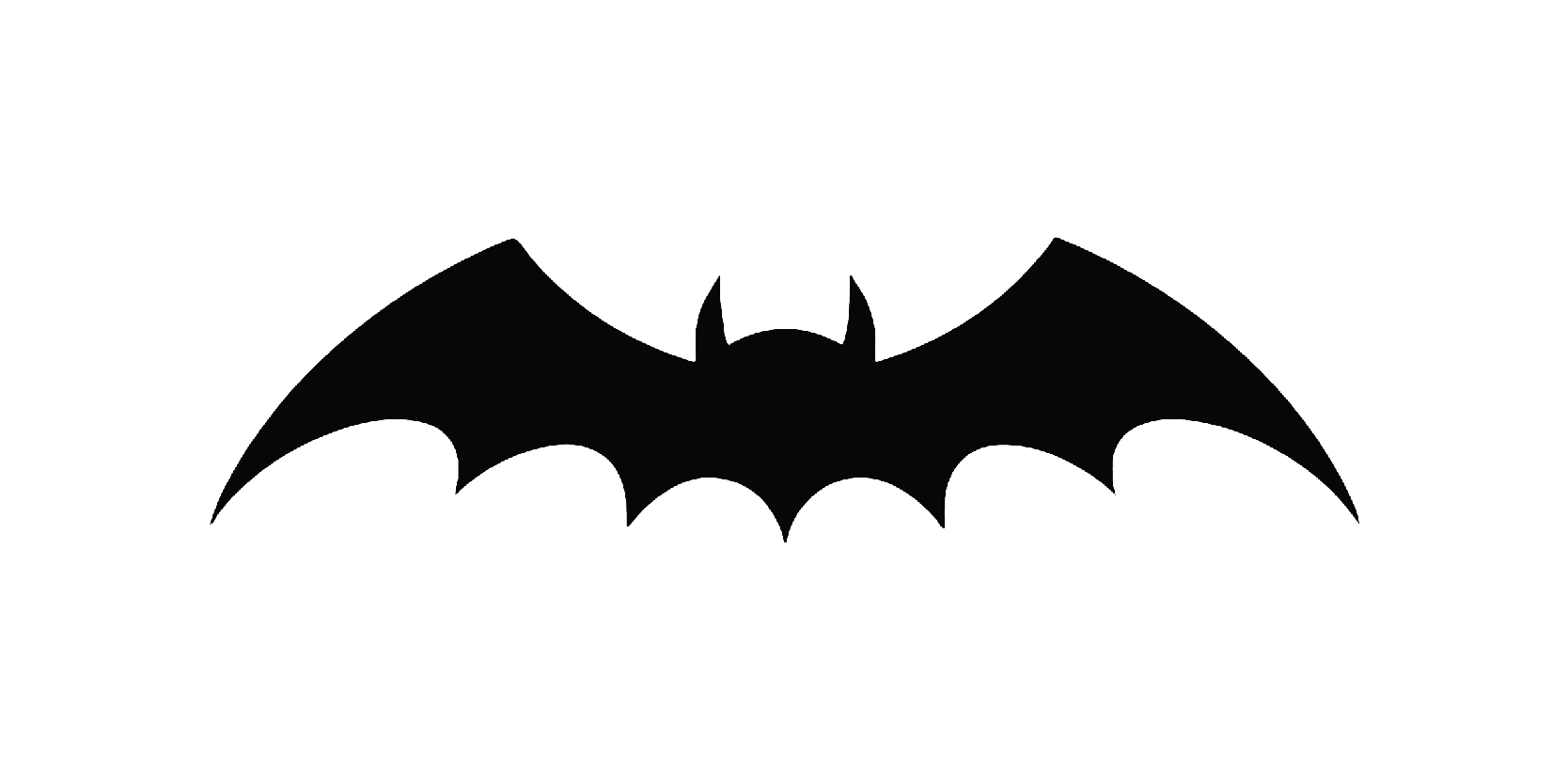
Batman first appeared in Detective comics #27 in May 1939, the iconic bat emblem looked very different from the sleek logos we know today. This original version was minimalistic, functional, and crude, serving as a basic visual identity for a brand-new character.
The logo featured short, rounded bat wings with no separation between the wings and the body. It had a straight, stiff silhouette, more insect-like than threatening. The debut logo was considered to be one of the most simple of all time and didn’t have a yellow oval at first.
A widened approach: 1941-1944
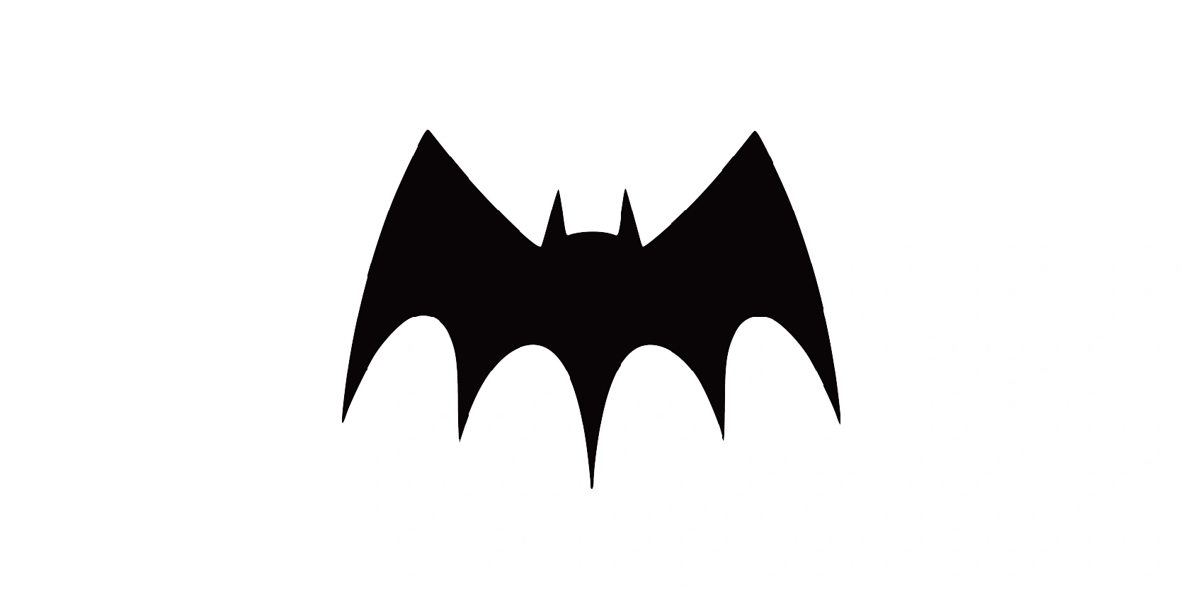
Between 1941-1944, the Batman logo underwent its first major refinement, evolving from a basic, almost blob-like bat shape into something that more clearly resembled a bat. This period helped solidify the emblem as a core part of Batman’s identity.
The wings became wider and more angular, with clearly visible scalloped edges, much closer to what we now associate with bat wings.
For the first time, the logo featured a small bat head with ears, placed at the top center of the emblem. This gave the symbol a more realistic and menacing look. The entire silhouette was thicker and more pronounced, making it easier to recognize at a glance, even in smaller comic panels.
Redefined look: 1944-1946
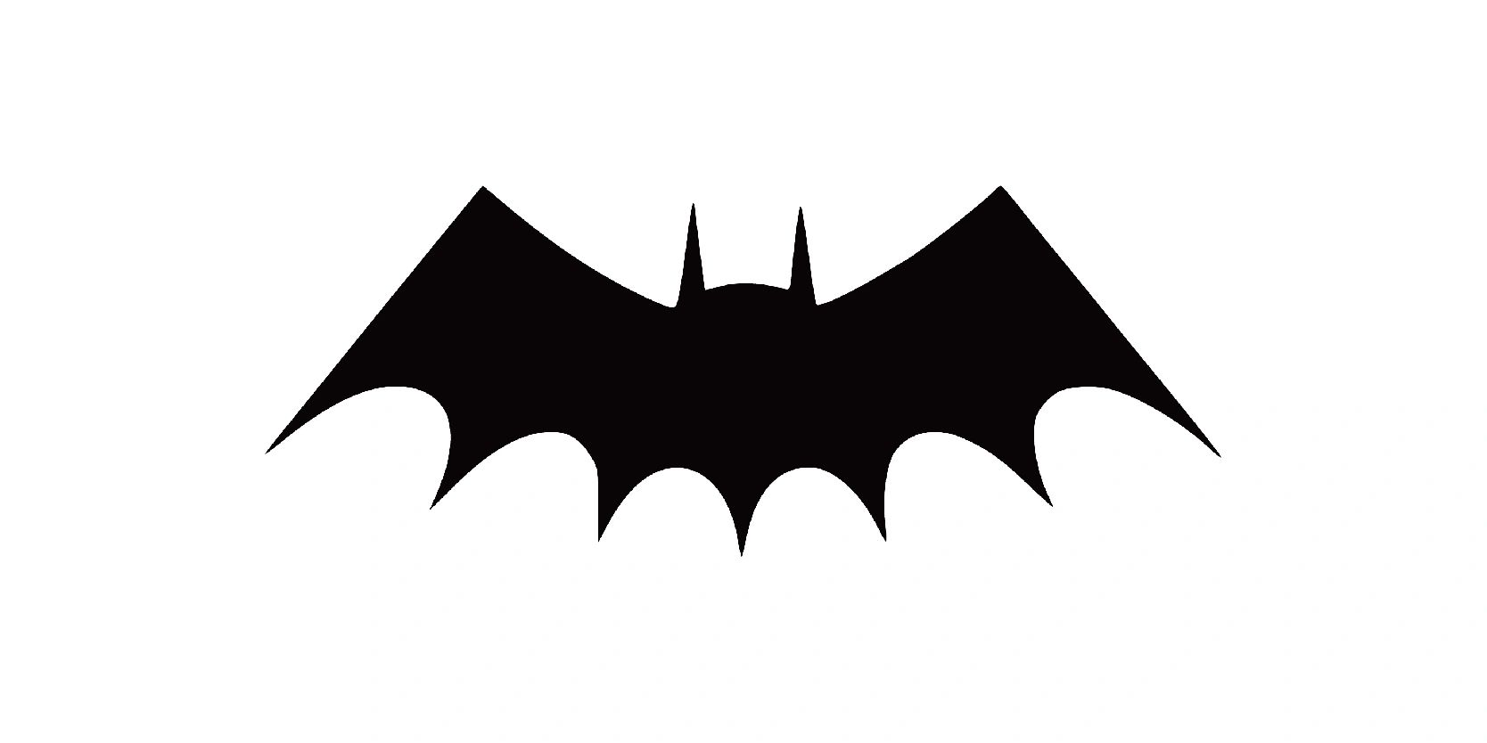
During 1944-1946, the Batman logo continued to evolve with greater emphasis on size, detail, and presence. This version marked a turning point where the emblem wasn’t just an abstract shape, it was a clearly stylized bat, meant to command attention and reinforce Batman’s growing legend.
The wings became much wider, now stretching across the full width of Batman’s chest. This made the logo more visually dominant and dramatic.
Even by this time, the yellow oval still wasn’t present, just a flat black silhouette that emphasized stealth and intimidation.
Original look: 1946-1950
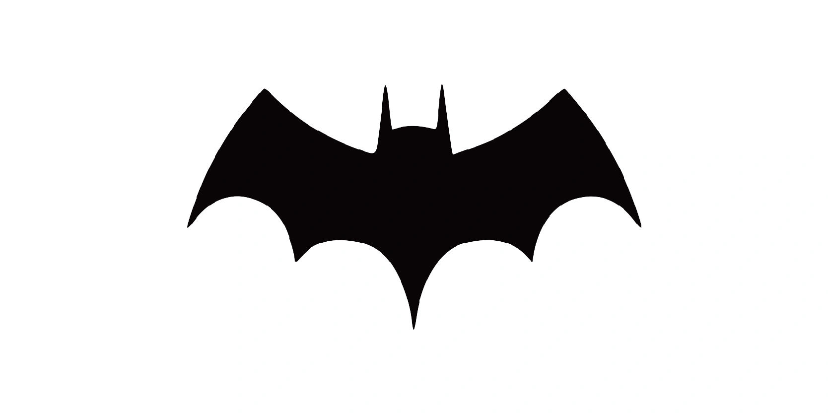
From 1946-1950, the Batman logo saw a shift toward a more compact and refined design, signaling the start of a sleeker, less bulky look for the character. While still maintaining the essential bat silhouette, this version introduced subtle design tweaks that balance menace and elegance.
The bat’s wings still featured five curved scallops on each side, but they were now more evenly spaced and rounded, contributing to a more polished appearance.
Smoother curves: 1950-1956
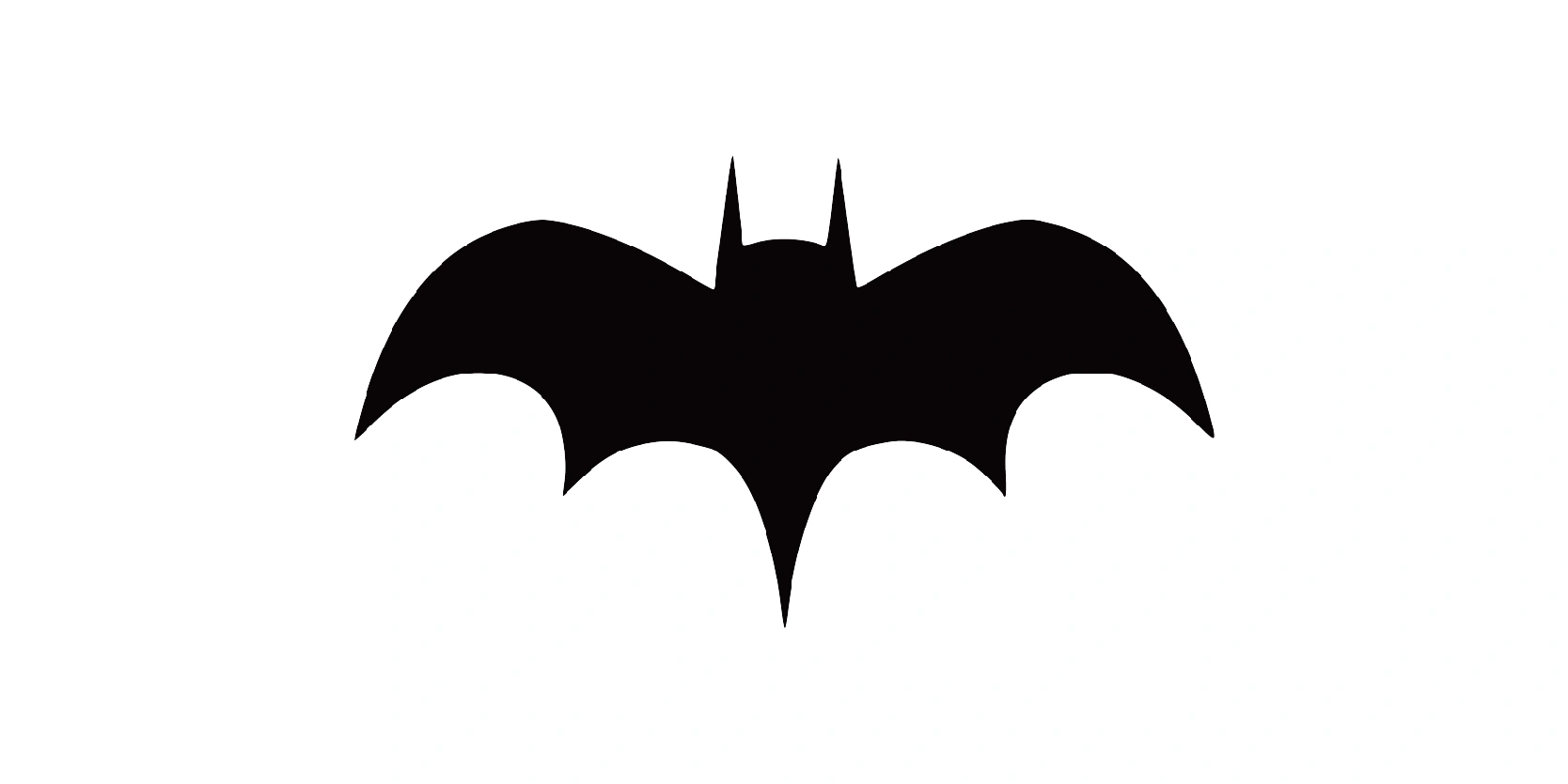
The 1950-1956 era of the Batman logo saw another step in the emblem’s slow but steady transformation. While still sticking to a black silhouette without color or background, the bat symbol became sharper, taller, and more streamlined, laying the groundwork for the iconic yellow-oval version that would arrive a few years later.
The overall shape became less bulky and more symmetrical. The wings and body formed a more deliberate silhouette, ideal for reproducing clearly on comic covers and merchandise.
The bat’ head was reduced in size but featured longer, sharper ears, giving the logo a more defined, stealthy profile.
More compact: 1956-1958
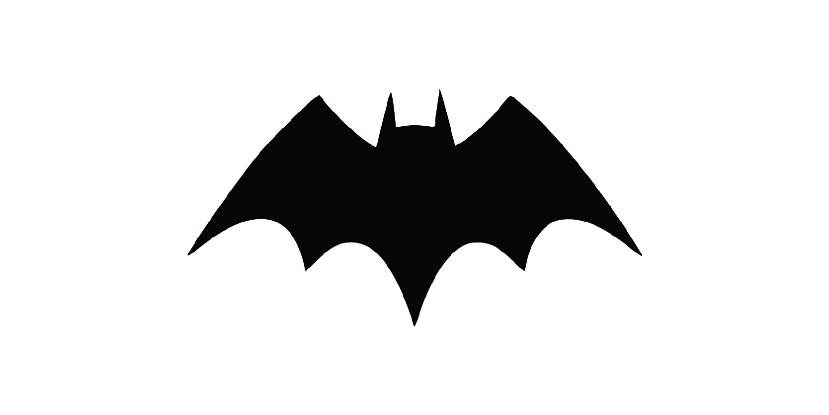
Between 1956 and 1958, the Batman logo entered its final phase before a major transformation. Artists wanted to provide enough breathing space for the logo, so they made the logo look more compact, and wide. This triangular version was widely used in the 1950s.
However, it was only used for two years so it wasn’t longer before it underwent another change.
A thinner approach: 1958-1960
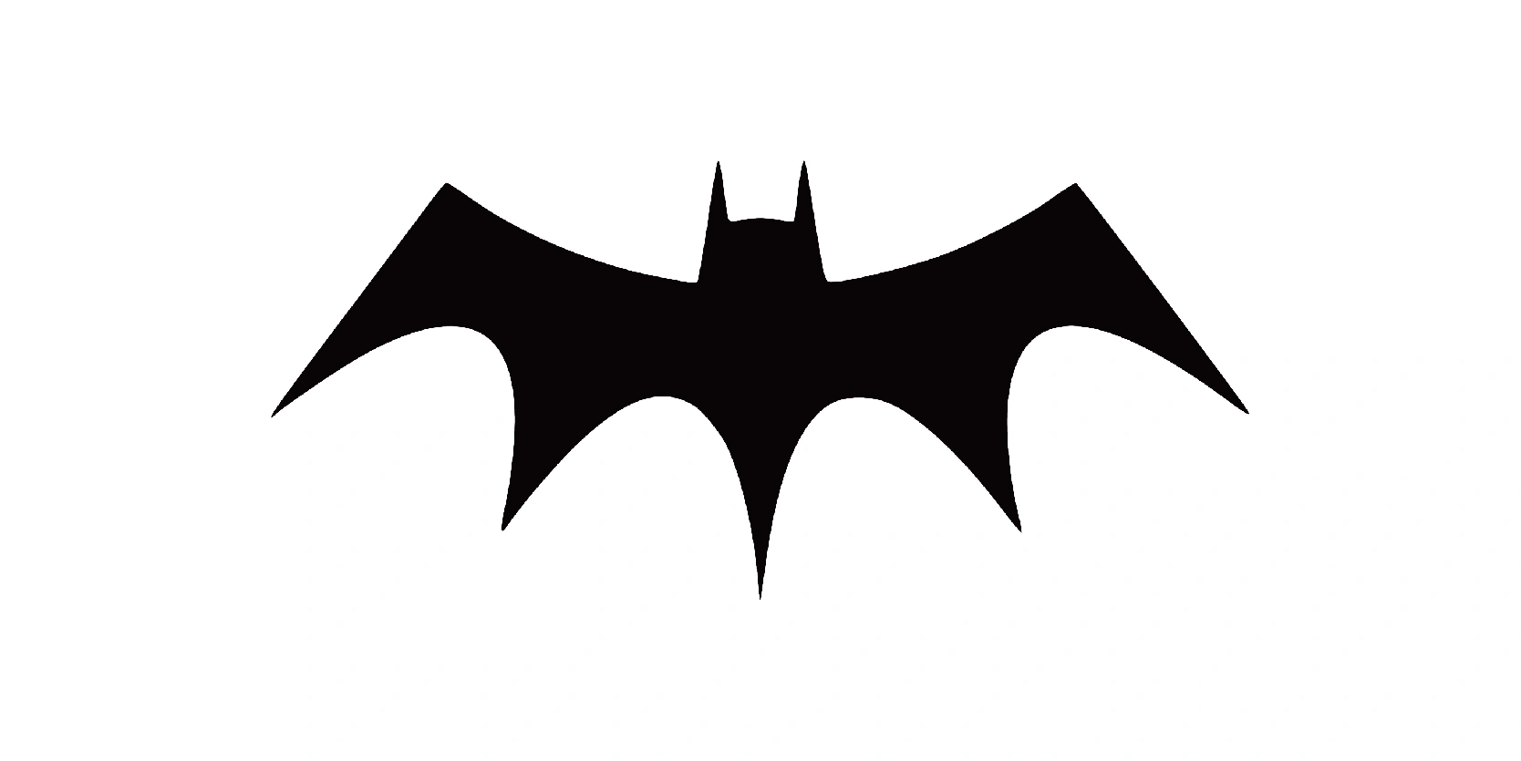
In 1958, artists were thinking of re-introducing the thinner and wider approach. This version of the logo made the head look much more visible than all the other previous versions and started to come much closer to its original shape of the Batman logo that we know of in the modern day.
The logo was once again growing wider and thinner, and the wings were becoming long and sharp.
Similar look to 1950s: 1960-1964
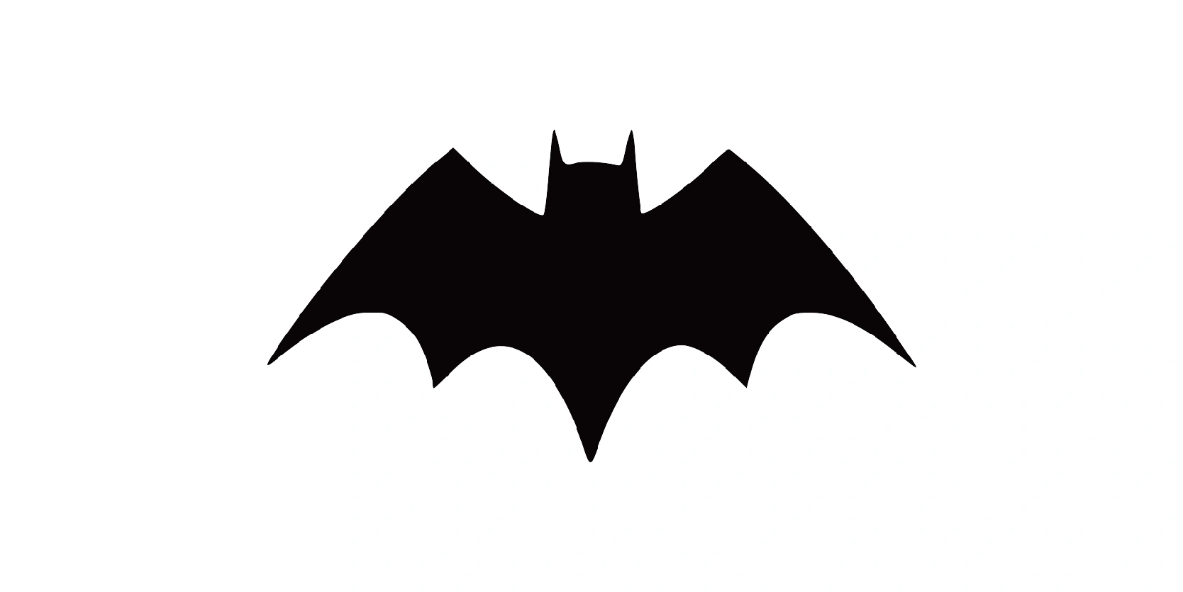
This was the last Batman logo before the yellow oval was introduced and the final refined version of the black bat symbol, representing the final phase of the classic bat emblem. This version emphasized balance, simplicity, and clean design, laying the groundwork for the dramatic update that would follow.
The bat symbol had a wide and stable wingspan with five clean, rounded scallops on each side. This design was symmetrical and looked more engineered than hand-drawn.
The bat’s head remained a small, centered triangle with long, upright ears, giving the logo a sharp but subtle focal point.
Introduction of yellow oval: 1964-1966
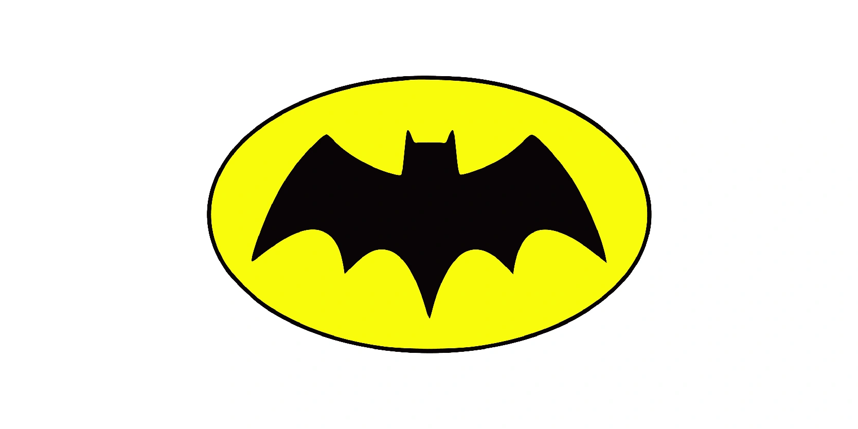
The years 1964 to 1966 marked a major turning point in the visual history of Batman. This period introduced one of the most iconic and enduring elements of the character’s identity: the yellow oval behind the bat symbol. This was more than a cosmetic update, it was a branding revolution that helped bring Batman back into mainstream popularity during a time when his comics were losing relevance.
The bat within the oval was flatter, shorter, and simplified, with five distinct wing scallops and a centered head with sharp ears. It was carefully redesigned to fit cleanly inside the oval’s dimensions.
The oval was meant to give Batman a “New Look,” a fresh, modern update that aligned with editor Julius Schwartz’s mission to revitalize the character.
A real icon: 1966-2000
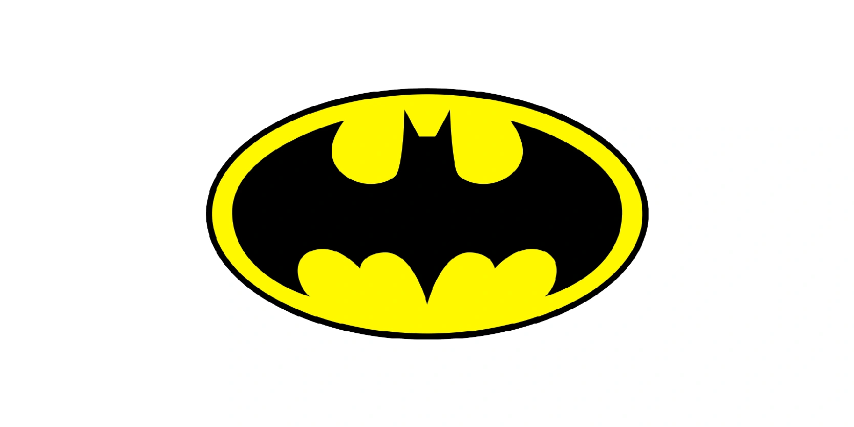
From 1966 to 2000, the yellow oval bat emblem became Batman’s most iconic and longest-standing logo. Introduced just two years earlier, the yellow oval was fully embraced across comics, television, films, animation, and merchandise, becoming the global symbol of the Dark Knight for over three decades.
The bright yellow ellipse remained behind the bay symbol across most media. It created a striking contrast and became synonymous with Batman’s chest emblem and overall branding. The bat shape was refined and while the bat inside the oval had a centered, triangular head with sharp ears; also, a more compact, and rounded form to fit snugly within the oval.
A modern approach: 2000-present
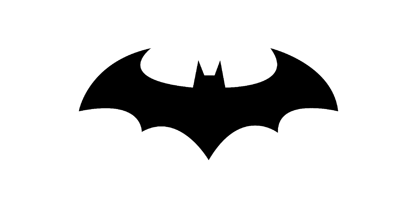
From 2000 and on, the Batman logo entered a new era, dropping the iconic yellow oval in favor of a simpler, more intimidating black bat silhouette. This shift reflected a darker, grittier interpretation of the character in both comics and film, as Batman returned to his roots as a shadowy, fear-inducing vigilante.
The yellow oval was first introduced in 1964, but was officially retired from Batman's main costume starting in 2000. This decision reflected a tonal shift away from the colorful, campy era and toward a more serious, mature Batman.
Secondary option: 2011-2016
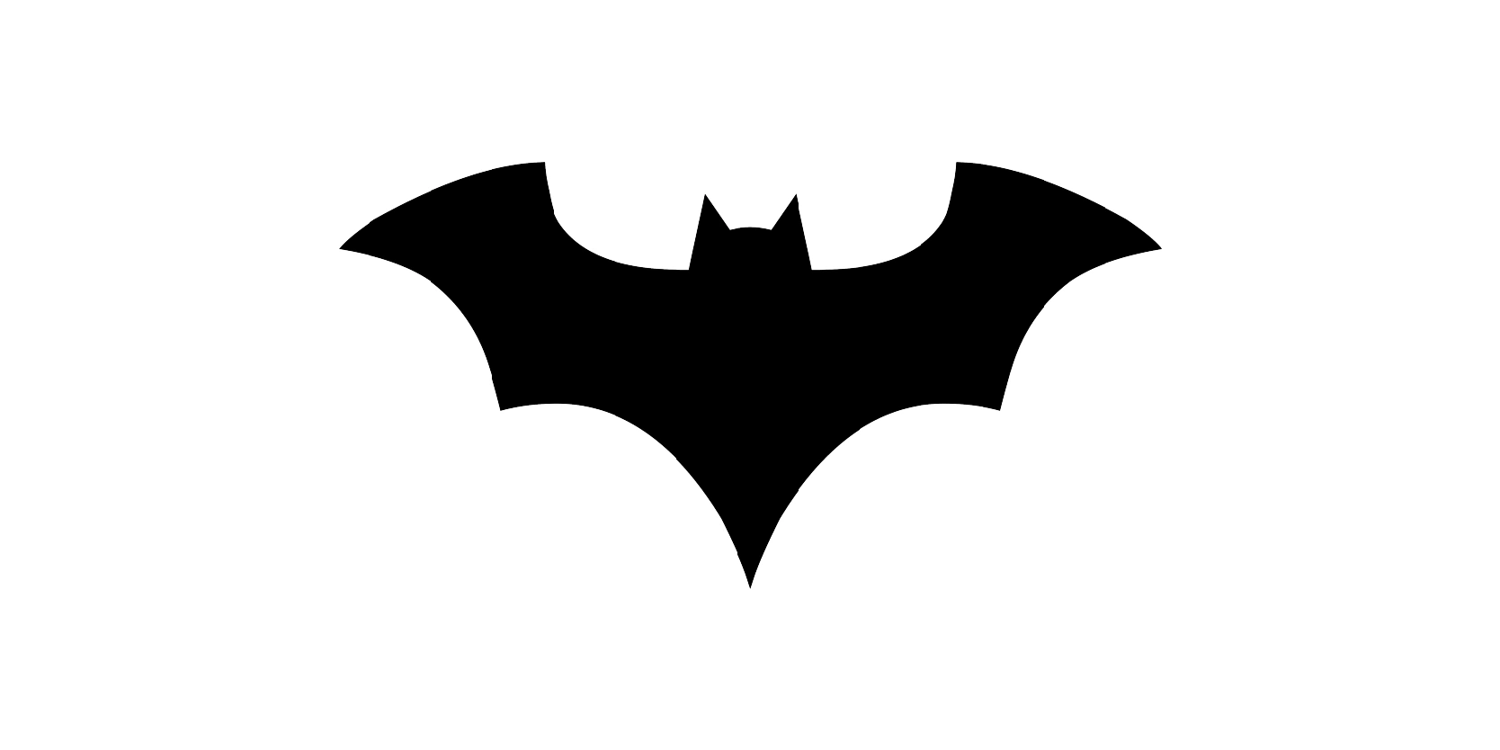
This logo was used as part of DC's new 52 initiative, which rebooted its entire comic book universe. The bat symbol featured extended, sharp wings with a strong horizontal emphasis. The tips were jagged and aggressive, making the bat feel more predatory and menacing.
The logo was typically rendered as a solid black silhouette, maintaining the no-oval style introduced in 2000. It had a thicker body and larger wings, giving Batman a bold, muscular chest emblem.
Last years of secondary option: 2016-2018
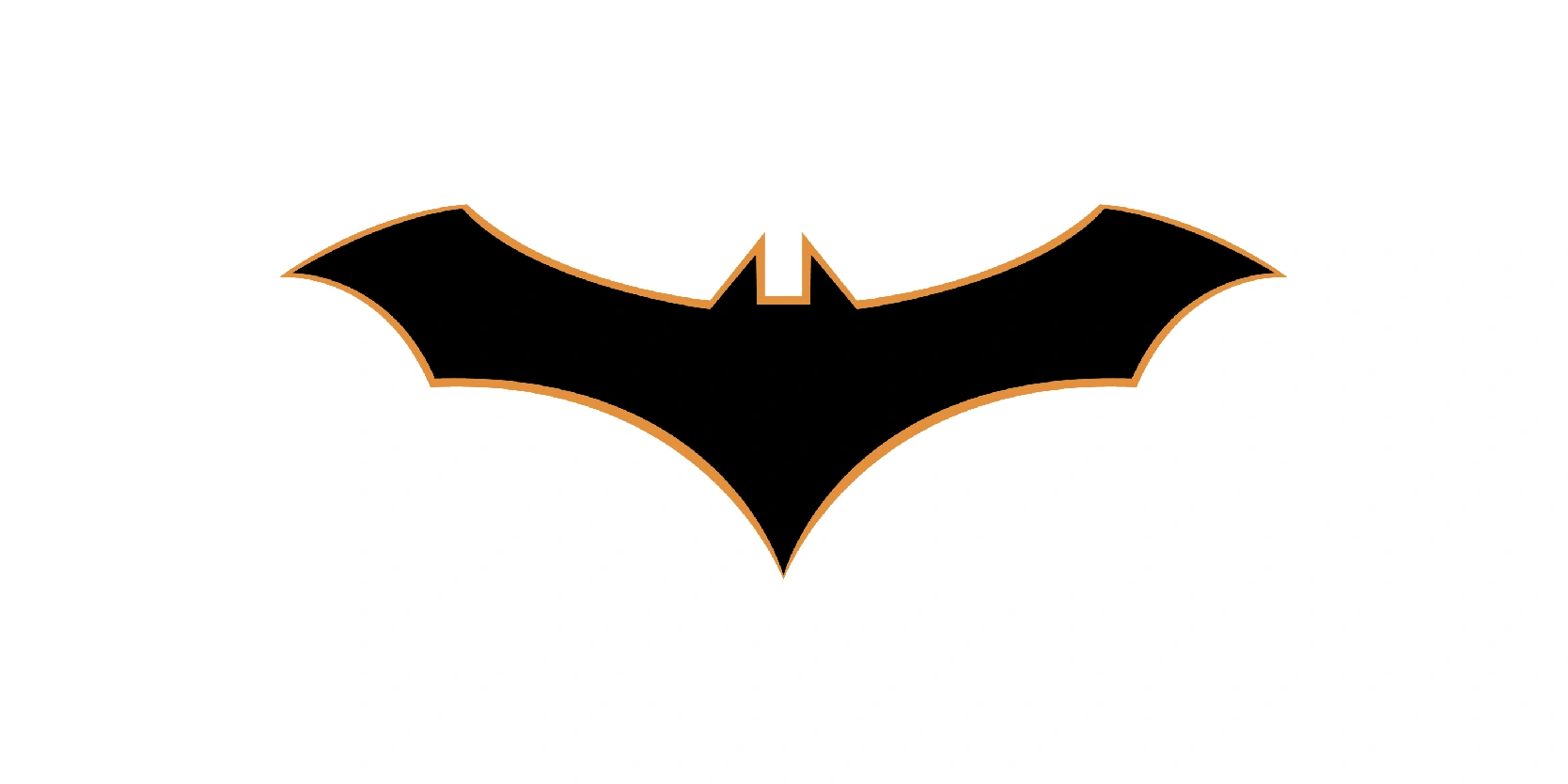
This Batman logo design is a stylized, modern variation that closely resembles the one used in the Batman Beyond animated series.
This was the first time ever that the Batman logo introduced a thin orange border for contrast. The wings are broad and curved upward, forming an almost “M” shaped top.
Each wing ends in a sharp, angular tip, giving the bat a dynamic, and aggressive appearance. The lower body tips into a long-pointed tail at the center, resembling the shape of a V.
The nearly 100-year evolution tells a powerful story
The nearly 100-year evolution of the Batman logo tells a powerful story, not just of a superhero, but of a brand that has adapted to changing times, audiences, and storytelling styles.
From the rough, simplistic wings of 1939 to the sharp, futuristic emblems of today, each version of the logo reflects the era it came from, whether it was the noir-drenched crime fighter of the 1940s, the colorful pop icon of the 1960s, or the shadow symbol of fear in modern cinema and comics.
What we can learn from this evolution is clear: A successful logo doesn’t need to remain static, it needs to grow with its story. The Batman emblem has proven that consistency in core identity, combined with reinvention can seriously keep a brand iconic.
