For more than a century, the Ford logo has stood as one of the most recognizable symbols in the automotive world. From its humble beginnings in the early 1900s to the sleek, and modern design we see today, the emblem has evolved while holding tightly to its core identity.
Its iconic blue oval and flowing script have become synonymous with reliability, innovation, and American automotive heritage. What’s remarkable is how Ford has managed to refresh its logo over the decades without losing the elements that make it instantly identifiable.
In this article, we’ll dive deeper into learning more about how Ford managed to successfully make its logo design memorable in more than 100 years.
Ford Motor Co: 1903-1907
The image you’ve shared is the original Ford Motor Company logo used between 1903 and 1907. This ornate black-and-white emblem featured a decorative Victorian-style border surrounding bold lettering that read “Ford Motor Co. - Detroit, Mich.” Its elaborate design reflected the design trends of the early 20th century, giving it a formal, almost handcrafted feel.
Unlike the sleek blue oval we recognize today, this first logo emphasized Ford’s roots as a new, ambitious manufacturer in the heart of America’s automotive capital. It stood as a statement of craftsmanship and quality during the company’s formative years.
A new style: 1907-1909
The logo you’ve shared is Ford’s 1907-1909 design, which marked a major shift from the ornate style of its predecessor. This emblem took on an eye-shaped outline with “FORD” boldly printed in a strong, sans-serif typeface at its center. Surrounding the name were promotional phrases like “HALL MARK FOR QUALITY AND ECONOMY” and “EVERY CAR GUARANTEED TWELVE MONTHS.”
Clean Ford logo: 1909-1911
It wasn’t until 1909 that the automaker started to use Henry Ford’s signature to represent its visual identity. The name still remains the core identity of the company today, but the only thing that has changed is the new color palette.
Let’s not also forget that the wordmark also changed to new script lettering which featured the “d” having an extended tail, but this wouldn’t continue very long as it was just something Ford itself wanted to test out.
Above all, let’s not forget that the 1910s logo was created in monochrome and didn’t have any framing, only the quotes.
Name change again: 1911-1912
Ford underwent another redesign in 1911, and again, they managed to change the name, but this time, they included “THE FAMOUS MOTOR CARS” around the company’s name. The difference of the logo is now that it’s enclosed in a double horizontal oval, but safe to say again, this wouldn’t last again much either.
A whole new design: 1912-1917
Between 1912 and 1917, Ford used a logo that stood out for its distinctive design. We have to say that it was advanced for its time and featured the words “The Universal Car” beneath the iconic “Ford” script, emphasizing the company’s ambition to create a vehicle for everyone.
The logo had a more ornate, decorative border shaped like a winged or scroll-like frame, giving it a stylish, almost art nouveau feel that contrasted with the brand’s later, more minimal designs.
The script itself was refined but still retained the personal, hand-drawn touch of Henry Ford’s signature style. While it may seem intricate by today’s standards, the 1912-1917 logo captured the optimism and creativity of the early automobile industry. It served as a bold emblem of Ford’s growing influence and its mission to revolutionize personal transportation during the Model T’s peak years.
Design that lasted: 1917-1927
Until this peak, this was the first time Ford used a logo design for a decade. This logo design looked more modern, and the ornate frame of earlier years was replaced with a clean oval outline, a shape that would become a long-lasting symbol for the company.
Inside the oval, the familiar “Ford” script, based on Childe Harold Wills’ stylized rendering of Henry Ford’s signature, took center stage.
This approach was aligned with the company’s industrial values and global expansion, helping the logo remain easily recognizable across advertising, vehicle parts, and dealerships. The 1917-1927 oval not only cemented Ford’s visual identity but also set the stage for future iterations that balanced tradition with modern appeal.
Shaping its modern identity: 1927-1957
This was the period where Ford started to shape its modern look into the now-familiar deep blue oval giving the brand a stronger, more polished visual identity. The “Ford” script remained the focal point, but the background color and thicker border added a sense of durability and prestige.
This change coincided with the debut of the Model A, marking a new chapter after the legendary Model T era. The blue oval wasn’t just a stylistic choice, but it symbolized trust, reliability, and quality, values Ford wanted to emphasize as it expanded its vehicle lineup and market presence worldwide.
Interestingly enough, the logo remained for three decades and by the end of this period, the blue oval had become inseparable from ‘Ford’ brand image, laying the foundation for the company’s enduring visual legacy.
Adjustments: 1957-1961
Between 1957 and 1961, Ford temporarily stepped away from its traditional blue oval in favor of a more elaborate crest-style logo. This emblem featured a shield looking emblem, added with white detailing, using a totally new font that made the wordmark look much more artistic, but interestingly enough, it didn’t last that long.
This shift reflected Ford’s push to present itself as not just a maker of reliable cars, but also as a brand of prestige.
Shaping its near modern look: 1961-1965
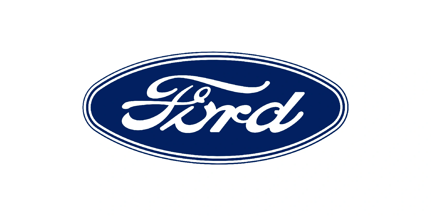
The previous logo was only used for four years, and after that, Ford decided to update the frame and color palette. The white frame looked much smoother, creating a much more elegant look for the white medallion.
The color blue now was more original and used for the badge’s background, adding more professionalism and strength to the logo. However, this logo variant also only lasted four years.
Last logo variant: 1965-present
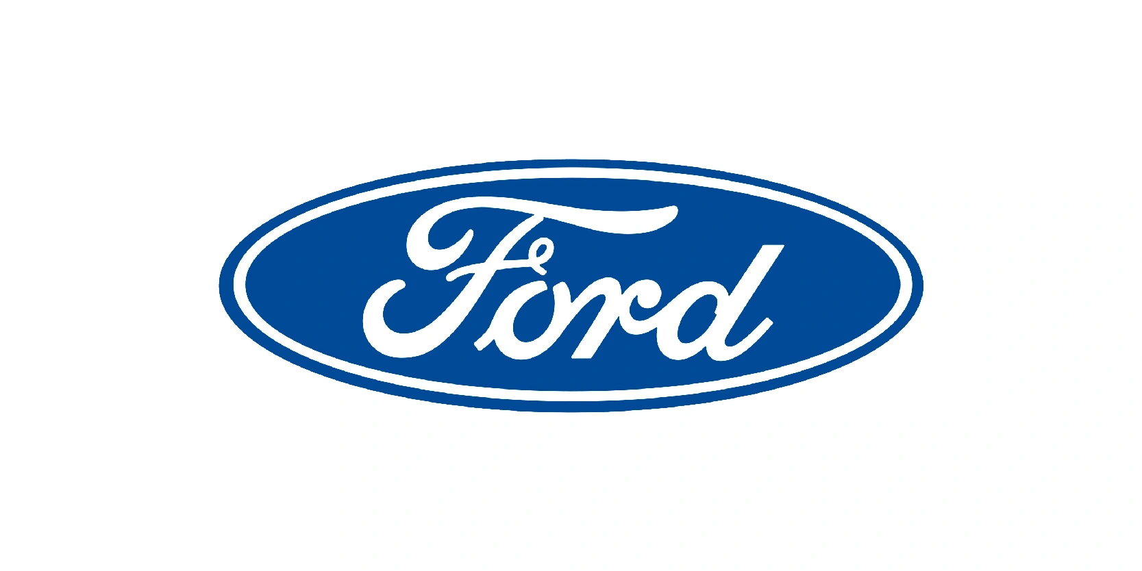
From 1965 and on, Ford decided to use its most enduring and iconic logo design, which was the refined blue oval with the elegant white “Ford” script. This version brought back the simplicity and brand recognition that earlier experiments had set aside.
The oval’s deep blue background conveys trust and dependability, while the flowing script, based on Henry Ford’ signature, preserves the company’s heritage. Over the decades, subtle updates have modernized the look: Cleaner lines, smoother edges, and richer color gradients for a sleeker, more contemporary appeal.
Secondary logo: 1976-2003
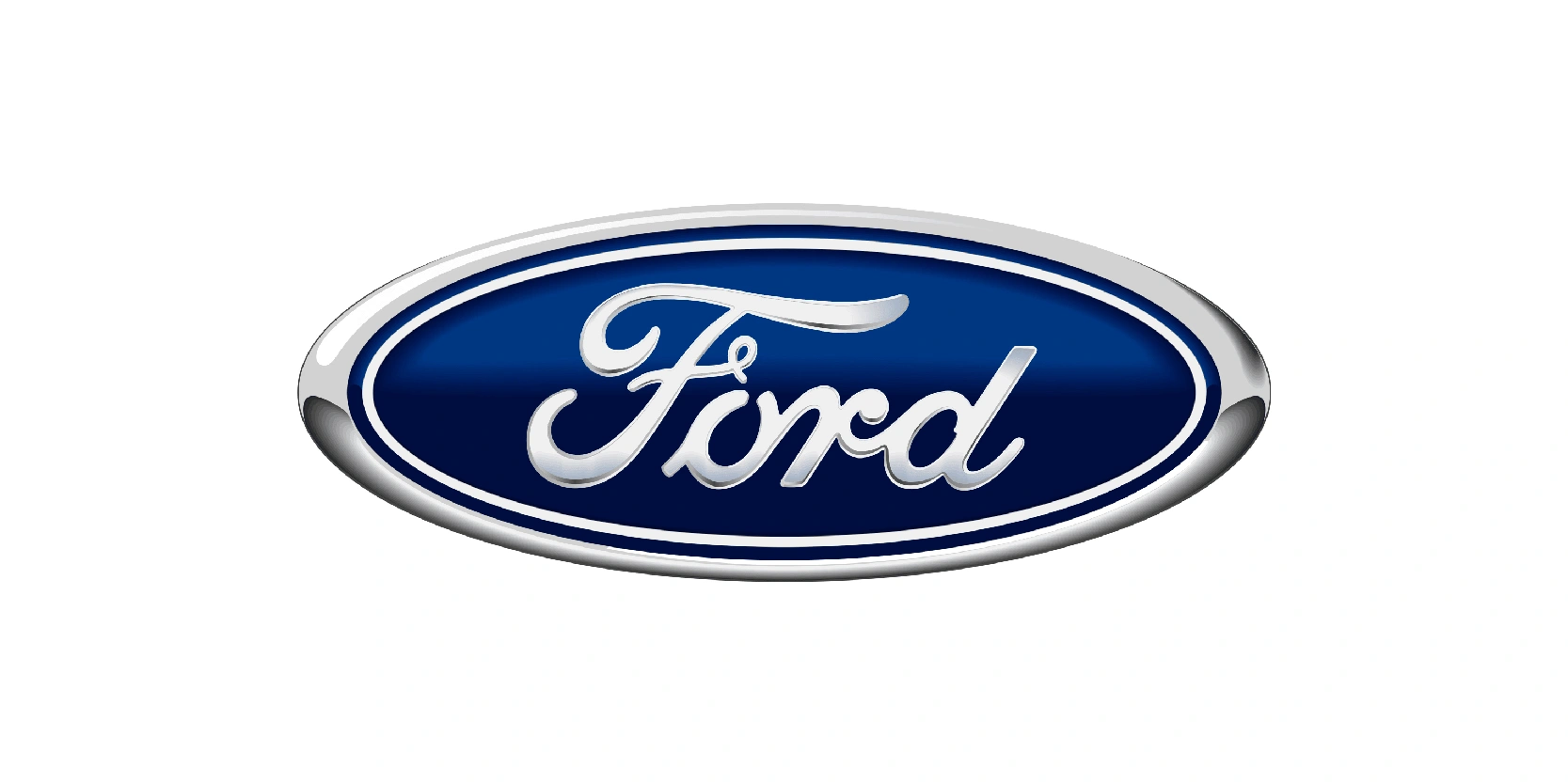
In 1976, Ford decided to use a secondary logo alongside its main blue oval, a bold, circular design featuring the word “Ford.” Set against a solid blue background with a thick silver border, it had a strong, industrial feel that emphasized clarity and impact over elegance.
The logo shined in its own way, adding some gloss to the surface and it’s quite noticeable that the blue here has gradient shades.
Richer gradient: 2003-2017
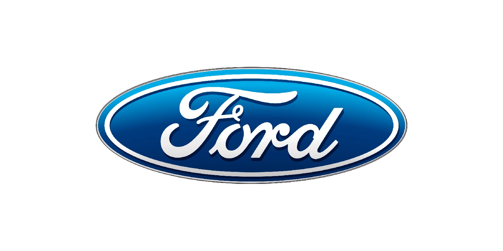
This update gave the emblem a more three-dimensional, polished look with gradient shading and a silver outline. The blue background shifted to a richer gradient, transitioning from deep navy at the top and bottom to a lighter, vibrant blue in the center. The “Ford” script remained unchanged, but the glossy effects made it appear sleeker and more modern.
The design aligned with early 2000s branding trends, which favored depth and metallic finishes to signal innovation and sophistication. By keeping the classic shape and script, Ford maintained its heritage while presenting a fresh, contemporary face for its global audience.
Ford’s logo journey reflects more than a century of innovation
Ford’s logo journey reflects much more than a century of innovation, adaptation, and brand loyalty. From ornate frames in the early 1900s to the sleek, modern Blue Oval recognized worldwide today, each redesign has balanced heritage with progress. The consistent use of the flowing “Ford” script has anchored the brand’s identity, ensuring familiarity even through bold stylistic shifts.
By evolving its design to match changing eras, whether through simplified shapes, richer colors, or subtle 3D effects. Ford has kept its image fresh without losing the trust and recognition it built over generations.
This ability to honor tradition while embracing modern trends is why the Ford emblem remains one of the most iconic automotive logos in history, symbolizing reliability, quality, and a legacy that continues to drive forward.
