Few confectionary brands have achieved the same level of global recognition as KitKat, and its logo has played a central role in building that identity. Since its introduction in the 1930s, KitKat’s visual branding has undergone several refinements, each reflecting not only changes in design trends but also shifts in marketing strategy and consumer behavior.
The famous red-and-white wordmark, with its bold typography and instantly familiar oval emblem, has become a timeless symbol of indulgence, simplicity, and sharing.
What exactly can we learn from KitKat’s logo journey, and why does it still resonate so strongly today?
Debate: 1935-1937
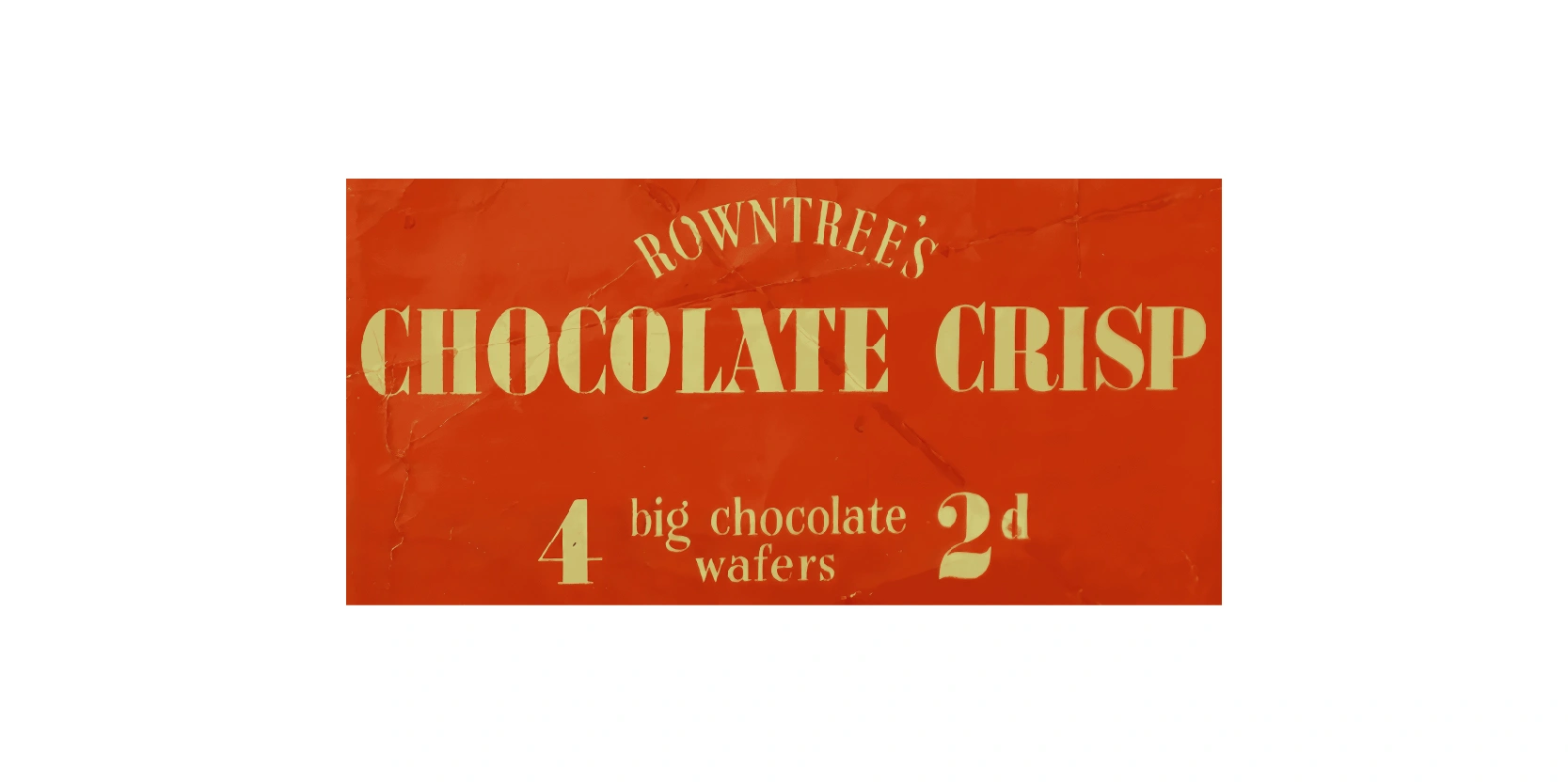
This vintage wrapper from 1935 to 1937 represents the very beginning of one of the world’s most famous chocolate bars, the KitKat. At the time, Rowntree’s launched the product under the name Chocolate Crisp, highlighting its key feature: four big chocolate-covered wafer fingers. The bold red background with gold lettering gave it a strong visual identity, which later evolved but kept the iconic red theme still used today.
Priced at just 2d (two old pence), it was affordable and quickly became popular with workers and families alike. This early design captures the simplicity and charm of 1930s confectionery packaging while laying the foundation for the global success of KitKat. It marks the origins of a timeless classic that remains beloved worldwide.
Second logo version: 1937-1942
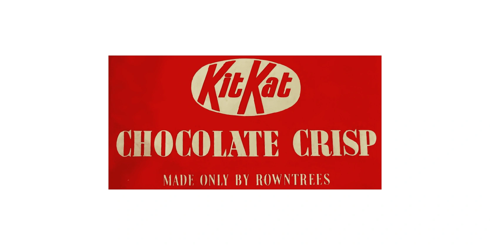
This wrapper shows the second version of KitKat’s design, used between 1937 and 1942. By this time, Rowntree’s had officially rebranded the bar from Chocolate Crisp to KitKat Chocolate Crisp, a name that would go on to achieve worldwide recognition. The design still features the bold red background but now introduces the distinctive KitKat logo in an oval shape at the top, making the branding much more prominent.
The phrase "Made only by Rowntrees” was added to emphasize authenticity and quality, building consumer trust. This packaging marked a turning point in the product’s identity, as the KitKat name began to take center stage. It represents the early evolution of a brand that would later become one of the most iconic chocolate bars globally.
Background color change: 1942-1945
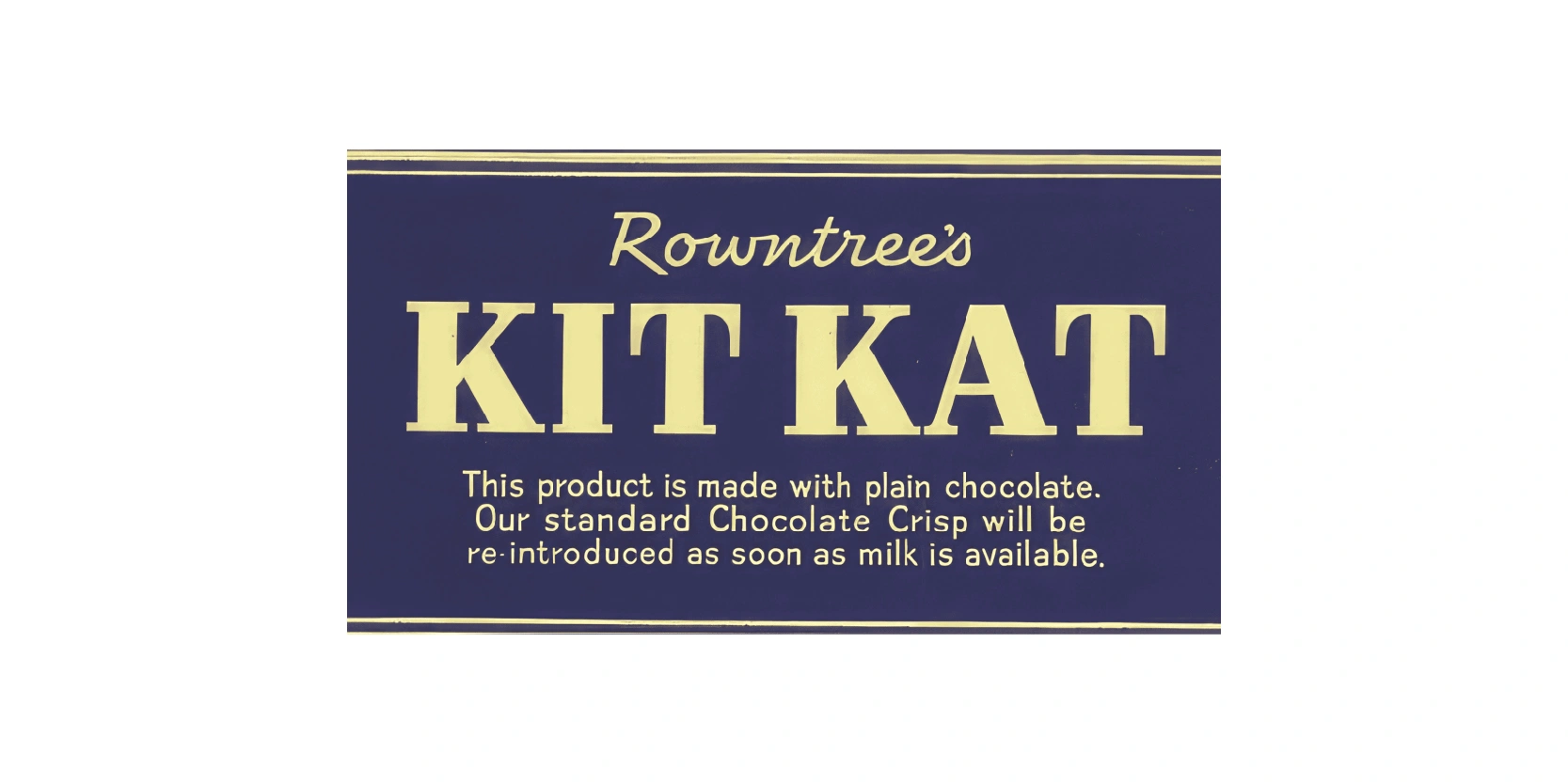
This wrapper from the wartime period between 1942 and 1945, when World War II heavily affected food production. Due to milk shortages, Rowntree’s had to change the recipe of KitKat, replacing its usual milk chocolate with plain chocolate. To make this clear to customers, the wrapper design shifted dramatically from the familiar red to a dark blue background.
The text openly explained “This product is made with plain chocolate. Our standard Chocolate Crisp will be re-introduced as soon as milk is available.” This straightforward messaging showed honesty and built trust during difficult times. Although temporary, the blue wrapper has become a unique part of KitKat’s history, symbolizing resilience and adaptation during wartime shortages, before milk chocolate returned after the war.
Red emblem logo: 1945-1970
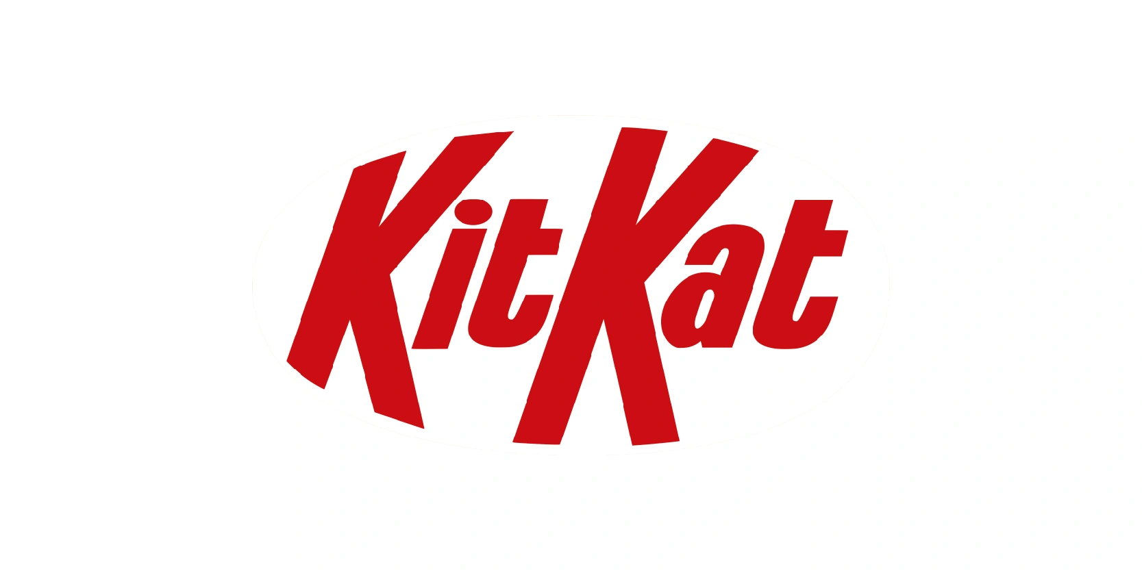
The KitKat logo from the 1945-1970s era introduced a bold and recognizable design that helped establish the brand’s strong identity. Featuring the brand name in bright red lettering, the logo used large, angled typography that immediately caught attention.
The sharp, elongated “K” letters stood out, giving the logo a unique and dynamic feel that separated it from other confectionery brands of the time. Its simplicity made it easily memorable, while the vibrant red symbolized energy, excitement, and indulgence, perfectly aligning with the idea of enjoying a sweet chocolate break.
This version laid the groundwork for KitKat’s long-term visual identity, reinforcing its catchy slogan “Have a Break, Have a KitKat” and cementing the chocolate bar as a household favorite during the post-war years.
Introducing the red circle: 1970-1988
The KitKat logo used from 1970 to 1988 kept its bold and energetic red wordmark but introduced a new element that made it even more distinctive: the oval border. This red oval surrounded the “KitKat” name, creating a strong frame that gave the logo balance and structure.
The typography retained its iconic elongated “K”s, preserving the brand’s recognizable look while enhancing clarity and consistency across packaging. The addition of the oval also made the logo more versatile, allowing it to stand out effectively on wrappers and advertising materials.
This era marked KitKat’s growing global recognition, as the logo became strongly associated with its famous chocolate-covered wafer bars. Overall, the redesign helped solidify Kitkat’s image as both modern and timeless.
Adding Nestle to it: 1988-1995
The 1988-1995 KitKat logo marked a bold and modern update to the brand’s identity. During this period, Nestle refined the design to emphasize clarity and recognition, making it more suitable for global markets.
The wordmark “KitKat” was presented in a sleeker, more compact font with stronger, cleaner lines that stood out against the iconic red background. The oval shape surrounding the text was made more prominent, giving the logo a polished, unified look that instantly caught the eye on shelves.
This version reflected the late 1980s and early 1990s design trends, focusing on simplicity, boldness, and brand consistency. It effectively reinforced KitKat’s reputation as a fun yet reliable chocolate snack while laying the groundwork for the enduring logo style still familiar today.
Change in background color: 1995-2004
The 1995–2004 KitKat logo introduced a fresher, more dynamic look while keeping the brand’s signature elements intact. The familiar oval frame remained central, but the design was modernized with smoother curves and a slightly brighter, more vibrant red background to enhance visibility.
The “KitKat” wordmark was given more depth and boldness, with a subtle 3D effect that made the logo feel energetic. This version balanced tradition with innovation, making sure that the logo stayed recognizable while appealing to changing consumer tastes in the late 1990s and early 2000s.
Its cleaner presentation and stronger emphasis on the red-and-white color scheme reinforced KitKat’s iconic image. This design set the stage for the sleeker, streamlined logos that would follow, cementing KitKat’s strong global identity. Of course, this was necessary since the 2000s introduced new logo trends
Using shadows: 2004-2017
The 2004–2017 KitKat logo brought a more polished and modernized style to the brand’s image. The iconic oval shape remained, but it was tilted slightly, and now had shadows included in them, creating a sense of motion and energy. The red background became brighter and more eye-catching, while the “KitKat” wordmark gained a refined, three-dimensional appearance with subtle shading and highlights.
This gave the logo a glossy, contemporary look that stood out on packaging and advertising. The update reflected early 2000s design trends, and let’s be honest, these trends were changing quickly from the ones in the 90s.
Despite these changes, the logo maintained its recognizable identity, ensuring consistency across global markets. This version successfully balanced heritage with innovation, keeping KitKat a memorable logo even for newer generations that saw the logo for the first time.
Removing double circles: 2017-2022
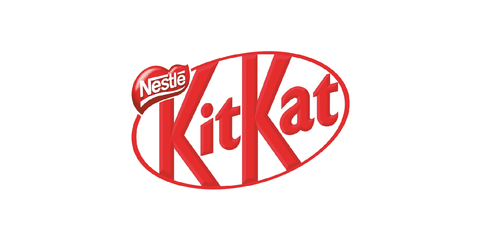
The 2017–2022 KitKat logo simplified the brand’s look while keeping its core identity intact. Nestlé moved away from the glossy, 3D-style design and adopted a flatter, cleaner appearance in line with modern minimalistic trends.
The oval frame was straightened and refined, removing the double circles. The “KitKat” wordmark remained bold and instantly recognizable in red. The background red tone was slightly adjusted to be brighter and more uniform, making the logo stand out in a fresh yet straightforward way. “Nestle” remained in white so there were no changes there.
This redesign emphasized clarity, digital friendliness, and timeless appeal, ensuring the logo looked sharp across both packaging and online platforms. By stripping back unnecessary effects, the 2017–2022 version highlighted as one of KitKat’s best logo designs.
2022-present
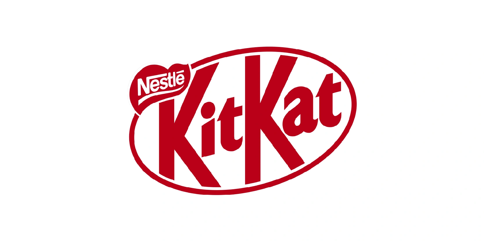
The 2022–present KitKat logo continues the brand’s move toward simplicity and modern clarity while preserving its iconic look. This version embraces a fully flat design, removing gradients and shadows for a cleaner, more digital-friendly appearance.
The oval frame remains central, but with sharper, more balanced proportions that give it a crisp and unique feel. The bold “KitKat” wordmark is retained in its classic style, ensuring instant recognition, while the red background has been refined to a consistent, vibrant shade that pops both on packaging and screens.
This update reflects current design trends that favor minimalism and versatility, making the logo adaptable across global markets. The 2022 redesign strengthens KitKat’s timeless identity, showing that simplicity can be powerful and instantly memorable.
There hasn’t been any modifications since, but KitKat is always innovating so we’ll have to see what they’re going to be up to soon enough.
KitKat’s logo evolution evolves over nearly a century
The evolution of the KitKat logo over nearly a century highlights how thoughtful design changes can keep a brand both timeless and relevant. From the early, traditional wordmarks to today’s sleek, digital-friendly identity, each update has balanced heritage with innovation.
KitKat has consistently maintained its core elements, which are its bold red, white contrast, and signature oval, refining its style to match cultural and design trends of each era at the same time.
This consistency has built strong global recognition, while subtle modernization has kept the brand fresh for new generations. The lesson is clear: successful branding isn’t about constant reinvention but about preserving identity while adapting to changing logo trends over time. KitKat’s logo history proves that evolution, not revolution, is the key to making your logo and brand memorable.
