Very few logos in sports are as instantly recognizable as the NBA’s red, white, and blue silhouette. Sleek, simple, and timeless, the NBA logo has stood strong for over five decades, but its design, origins, and the mystery behind the figure it features have sparked conversation among fans and branding experts alike.
There’s a lot to learn about this logo, and in this article, we’ll explore the evolution of the NBA logo, uncover the history and meaning behind its creation, and reveal the identity of the iconic player who inspired the silhouette.
Meaning and history of the NBA logo
The NBA logo is one of the most recognizable sports emblems in the world, but few know the rich history and meaning behind its design. The logo was first introduced in 1950, the current logo features a silhouette of a basketball player mid-dribble, set against a bold red and blue background. The logo was created by designer Alan Siegel, who aimed to give the NBA a visual identity that was sleek and dynamic as the sport itself.
The player in the silhouette is widely believed to be Jerry West, a Hall of Fame shooting guard for the Los Angeles Lakers. Although the NBA has never officially confirmed this, Siegel has openly stated that he based the design on a photo of West due to the player’s graceful posture and timeless form. The use of a silhouette made the logo feel universal, representing not just one player, but the essence of basketball– fluid motion, control, and balance.
The red, white, and blue colors mirrored the patriotic palette of the American flag, subtly positioning the NBA as the premier basketball league in the United States, especially during its growing rivalry with the ABA at the time.
Over 50 years later, the logo remains untouched, testament to its enduring impact and its role in shaping how we visually interpret the sport. It’s more than a logo; it’s a symbol of legacy, excellence, and the evolution of basketball itself.
The debut: 1950-1953

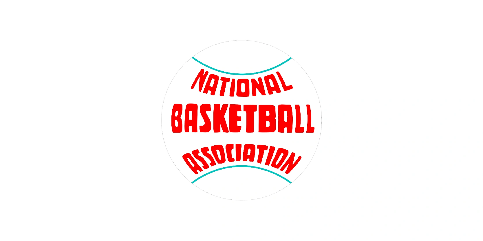
The NBA first introduced this logo in 1950 and was composed of a circular emblem, where the whole basketball was sketched. This emblem will always be considered vintage and reflects a very different era in professional basketball, one focused on formal identity rather than sleek, modern branding.
The design features a white basketball outlined with two green curved lines, resembling the seams of a ball. Inside the circle, the full name of the league- “National Basketball Association”-- is boldly spelled out in red, all-caps letters. The word “BASKETBALL” is emphasized in a larger, bolder font at the center, while “National” and “Association” are slightly arched above and below it, creating a balanced but classic feel.
While visually simple, this early logo served its purpose: It conveyed the league’s full name and directly referenced the sport it represented. However, it lacked the dynamic energy of visual symbolism that would later define the NBA brand.
This original logo is now a nostalgic piece of basketball history, offering a glimpse into the sport’s early professional years, before TV deals, superstar branding, and global expansion. Compared to the modern NBA silhouette logo introduced in 1969, this emblem feels more administrative and traditional, marking the league’s infancy before it grew into a global powerhouse.
Major changes: 1953-1962

The NBA logo used from 1953 to 1962 marked a transitional phase in the league’s branding. This version moved away from the more formal “National Basketball Association” text-based design and instead embraced a simplified visual approach that placed emphasis on the sport itself: The basketball.
The logo features a rust-colored basketball, textured to resemble a leather ball. Inside the ball, in bold white capital letters, the acronym “NBA” is prominently placed, giving the design a much-needed simplification.
Curved lines across the logo represent the seams of the basketball, reinforcing the sport’s central focus. Above the acronym, a small wordmark reading “National” appears, though it’s less emphasized and harder to read, highlighting the league’s growing preference for brevity.
During this time, the NBA was growing but still regionally focused, competing with college basketball and the emerging American Basketball Association (ABA). The branding here was still practical and conservative, reflecting a league in its development years.
While not flashy, this logo served its purpose: It was instantly identifiable as basketball-related, and it marked the beginning of the league’s move toward a stronger visual identity, one that would soon evolve into something more iconic in the decades to follow.
Complete color change: 1962-1969

The NBA logo from 1962 to 1969 reflected a more minimalistic approach as the league continued to evolve. In this version, the emblem focused entirely on the essence of the game: A basketball and the league’s initials. It was a no-frills, function-first design, suitable for a growing organization still developing its identity.
The logo is shaped like a realistic basketball, complete with black seam lines that wrap around its round form. The letters “N”, “B”, and “A” are placed diagonally across the center of the ball in bold, serif-style black font. The logo is monochrome, adding to its serious, straightforward aesthetic. There’s no additional flair, color, or symbolism, just a direct and clear reference to the league and its sport.
During this time, the NBA was still growing in popularity and competing for visibility against college basketball and the rival ABA. The simplicity of this logo reflected a transitional period, where outweighed branding sophistication.
This version served as the final logo before the NBA introduced its now-iconic silhouette design in 1969. While it lacks the dynamism of later iterations, it marked the league’s final use of a literal basketball as its emblem, it marked the league’s final use of a literal basketball as its emblem, soon to be replaced by a timeless image that captured the NBA’s movement and identity.
The next step to innovation: 1969-2017

The NBA logo from 1969 to 2017 perhaps is one of the most iconic and enduring sports logos in the world. Created by designer Alan Siegel, this version introduced the now-famous red, white, and blue silhouette of a basketball player in motion, which became the face of the NBA for nearly five decades.
The logo features a vertical rectangular frame divided into three sections:
- Red on the left
- White in the center
- Blue on the right
At the center is a white silhouette of a basketball player dribbling, meant to represent the athleticism, frame, and movement of the sport. Below or beside the figure, the “NBA” wordmark is typically included in clean, white, or blue lettering, depending on background usage.
Although the NBA has never officially confirmed it, the figure is widely acknowledged to be modeled after a photo of Jerry West, Los Angeles Lakers legend and Hall of Famer Alan Siegel chose West because of his smooth posture, balance, and classic style, making him the perfect model for a universal basketball identity.
This logo gave the NBA a strong, patriotic, and dynamic brand image, mirroring the MLB logo, which also used a player silhouette with red, white, and blue. It became a global symbol of excellence in basketball and was used across all branding, including uniforms, merchandise, arenas, video games, and broadcasts.
Modern day logo: 2017- present

From 2017 to today, the NBA logo remains largely the same in design but has undergone subtle refinements to align with the demands of the digital age. The iconic Jerry West silhouette, set against the red, white, and blue backdrop, has not been redesigned, a testament to its enduring impact and recognizability. However, small modern touches have been made to improve clarity, scalability, and consistency across all digital and global platforms.
The NBA slightly sharpened the silhouette’s lines and smoothed out some of the edges to make the logo crisper at smaller sizes, especially for mobile apps, social media, and high-definition displays.
The red and blue tones were subtly adjusted to appear more vibrant on screens, ensuring the logo looks just as powerful in digital spaces as it does on jerseys and courts. In some applications, the accompanying “NBA” wordmark was refined with cleaner letter spacing and bolder weight to improve legibility.
The evolution of the NBA logo is more than just a visual journey
The evolution of the NBA logo is much more than just a visual journey, it’s a reflection of how the league has grown from a modest, regional organization into a global sports and cultural powerhouse. From early logos that simply emphasized the league’s name or a basketball, to the creation of the iconic Jerry West-inspired silhouette in 1969, each iteration of the logo mirrors a specific era in basketball history.
What makes the NBA logo truly special is its ability to balance legacy and modernity. While styles, players, and technologies have changed dramatically over the decades, the silhouette has endured, symbolizing excellence, motion, and the soul of the sport. Even in today’s digital-first world, the logo remains as relevant and recognizable as ever, showing that a timeless design rooted in authenticity doesn’t need constant reinvention.
